Design
<- Return to all blogs
-
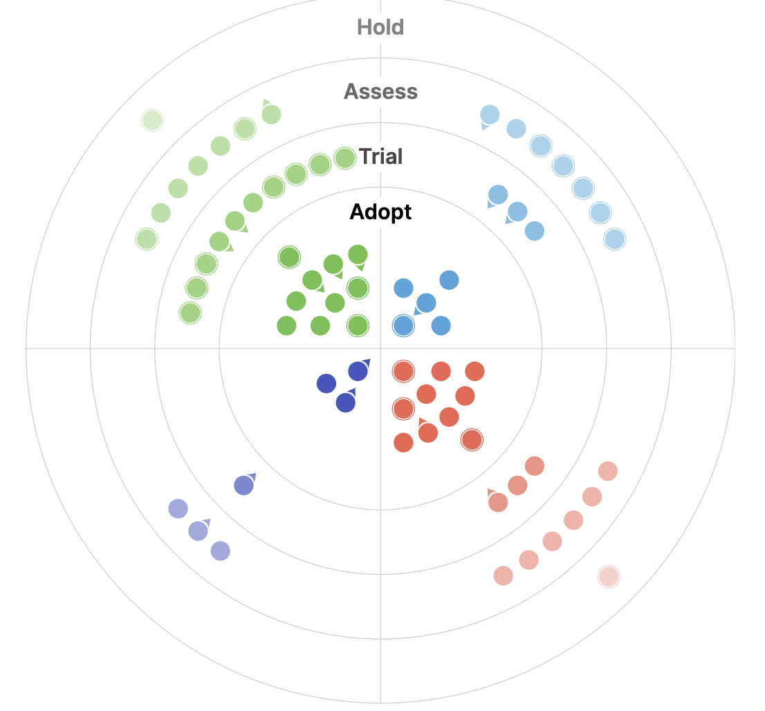
The 2025 Geospatial Tech Radar: Agentic AI, EO Embeddings, and Cloud-Native Maturity
We analyze trends and highlights from the third iteration of our Geospatial Tech Radar including Agentic AI and MCP, EO Foundation Models and Embeddings, and the solidification of Cloud-Native Geospatial.
-
The 2025 Geospatial Tech Radar: Agentic AI, EO Embeddings, and Cloud-Native Maturity
We analyze trends and highlights from the third iteration of our Geospatial Tech Radar including Agentic AI and MCP, EO Foundation Models and Embeddings, and the solidification of Cloud-Native Geospatial.
-
Designing risk visualizations: why appropriate complexity mattersВ
In this blog I detail some case studies that have been top-of-mind recently to demonstrate the importance of appropriate complexity, and how it can contribute to meaningful action when applied with intention, particularly in the context of risk analysis.В
-
Generating truly useful solutions to real problems with the help of user experience and AI
We discuss how AI and user experience methodologies might serve to connect scientists and researchers back to important data and technology to solve the world’s biggest problems.

-
Enhancing accessibility in a wildfire risk web application
Wildfires in the U.S. are becoming larger and more destructive driven by climate change, a century of forest mismanagement, and increasingly more construction in fire-prone areas. Since 2019, our team has contributed to Wildfire Risk to Communities, a free resource by the USDA Forest Service and Pyrologix in partnership with Headwaters Economics. Element 84 designed…

-
Updating our Geospatial Technology Radar for 2024
We introduce the second iteration of our geospatial technology radar, which is designed as a resource for the community to outline impactful technologies in the space.

-
Climate Unit Director Profile:В Catherine Oldershaw
In this blog series, we’re profiling the new directors of our business units to provide a full picture of how we’re gearing up to make the biggest possible impact in 2024 beginning with this feature of Catherine Oldershaw, our Climate Unit Director.

-
Introducing Earth Search Console: An AWS Open Data Exploration UI
In this blog, we’ll detail how Earth Search Console leverages FilmDrop, and what Console components we are most excited about.

-
The Importance of the User Experience Discovery Process
Outlining the value behind the UX discovery process, including how it adds clarity and helps stakeholders to establish an aligned vision.
-
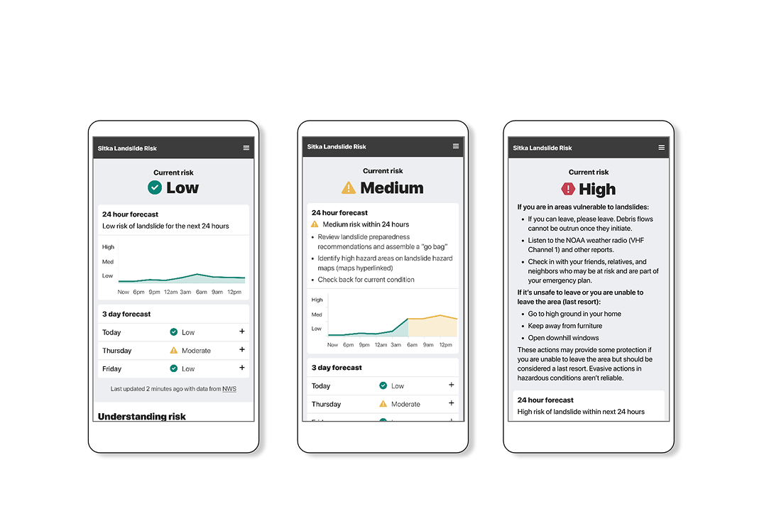
Building a fast-loading and responsive application using Next.js
Due to Next.js’ ability to populate webpages in remote areas, we used it to build a decision-support tool that conveys landslide risk.

-
Jeff Siarto on the MapScaping Podcast
Since 2010, we’ve been working with scientists and data providers at NASA, NOAA, and USGS to help improve their remote sensing data systems through better processing pipelines, metadata, and improved user experiences. A large part of that effort was aimed at improving time-to-science—reducing the amount of time spent downloading, processing, and preparing data versus actually…