Geospatial
<- Return to all blogs
-
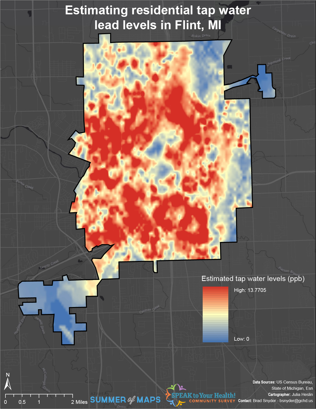
Interpolating Lead Levels from Tap Water Samples Following the Flint Water Crisis
This post is part of a series of articles written by 2017 Summer of Maps Fellows. Azavea’s Summer of Maps Fellowship Program is run by the Data Analytics team and provides impactful Data Analysis Services Grants for nonprofits and mentoring expertise to fellows. To see more blog posts about Summer of Maps, click here … The…
-
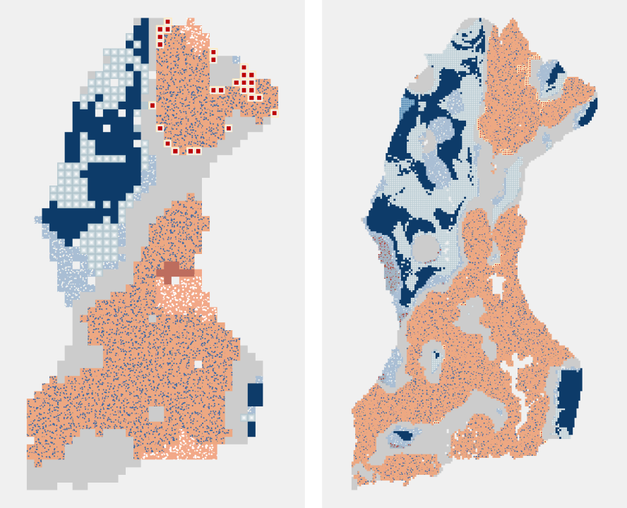
Emerging Hot Spot Analysis: Finding Patterns over Space and Time
This post is part of a series of articles written by 2017 Summer of Maps Fellows. Azavea’s Summer of Maps Fellowship Program provides impactful pro bono spatial analysis for nonprofits, while fellows benefit from Azavea mentors’ expertise. To see more blog posts about Summer of Maps, click here. Analyzing data over space and time can…
-
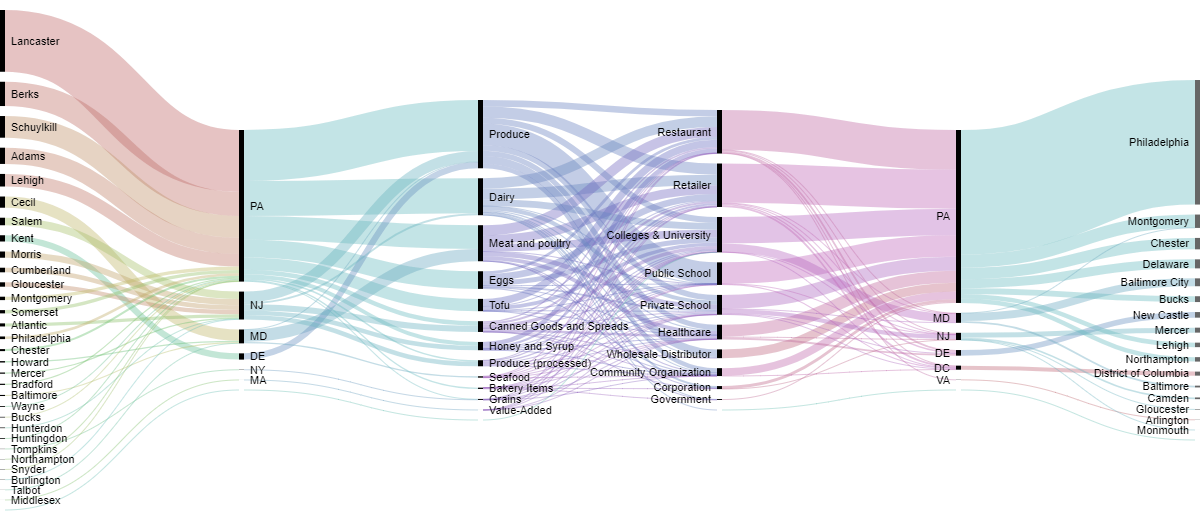
Sankey Diagrams: Six Tools for Visualizing Flow Data
This post is part of a series of articles written by 2017 Summer of Maps Fellows. Azavea’s Summer of Maps Fellowship Program provides impactful pro bono spatial analysis for nonprofits, while fellows benefit from Azavea mentors’ expertise. To see more blog posts about Summer of Maps, click here. One of the non-profits I am working…
-
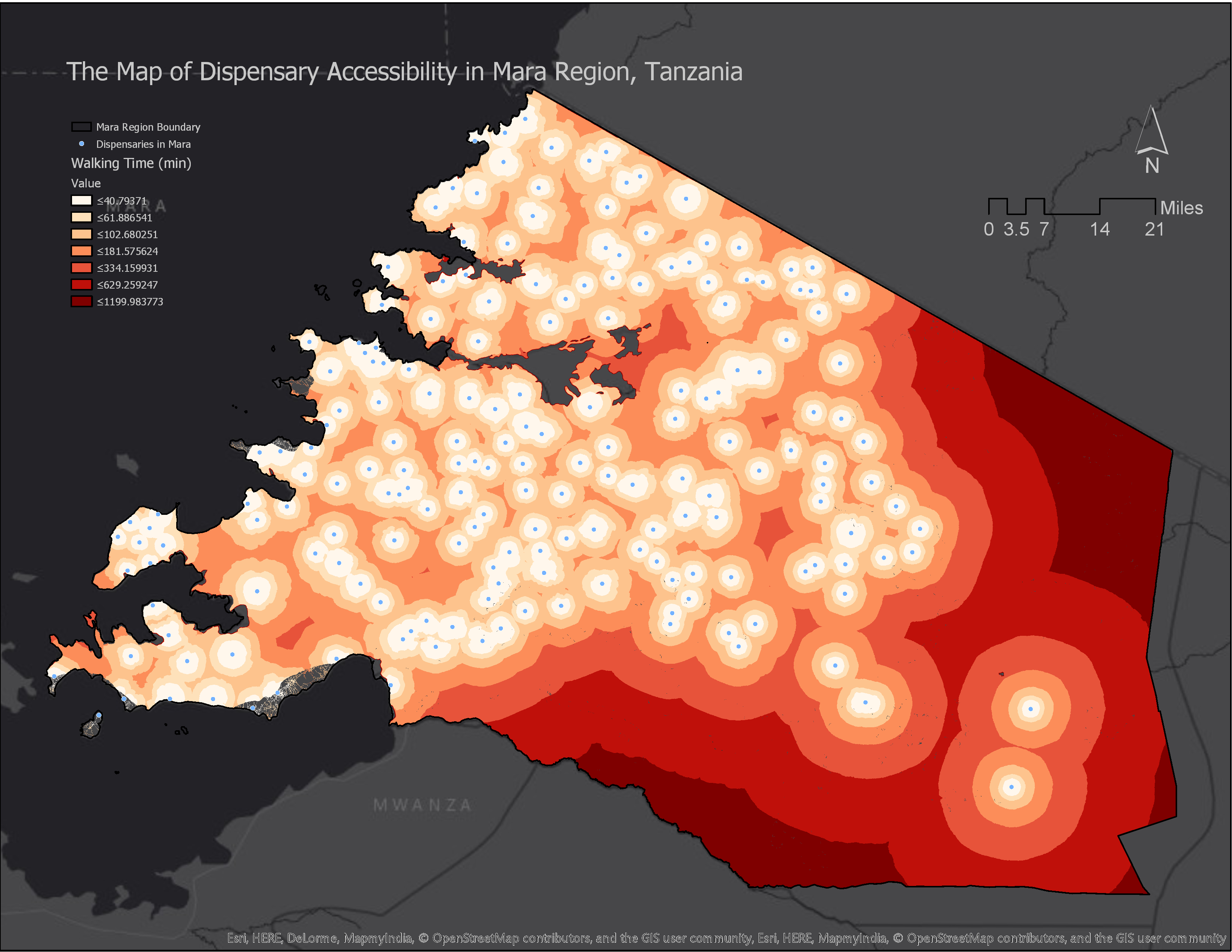
How to Calculate Location Accessibility with AccessMod 5
This post is part of a series of articles written by 2017 Summer of Maps Fellows. Azavea’s Summer of Maps Fellowship Program is run by the Data Analytics Team and provides impactful Data Analysis Services Grants for nonprofits and mentorship to fellows. To see more blog posts about Summer of Maps, click here. Mapping location…
-
Leveraging Node.js, D3.js, and HTML Canvas for Scalable Infographics
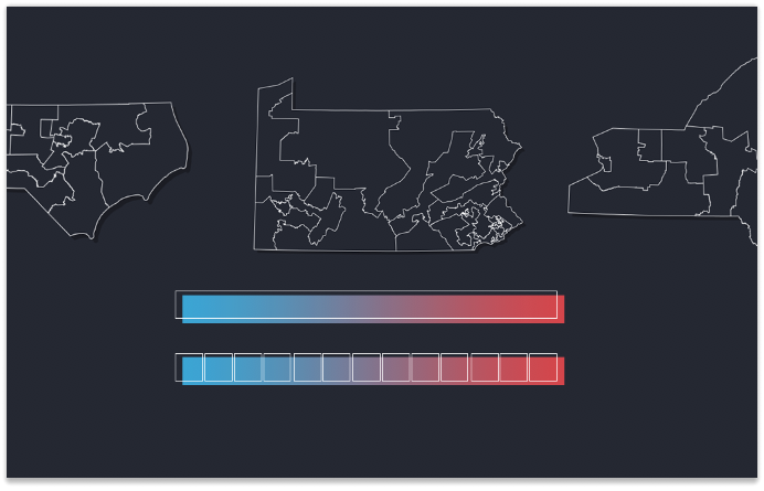
In Part 3 of our 3-part series on Azavea’s redistricting and gerrymandering work, we look at the technical process behind developing infographics for efficiency gap reports. We made strategic use of JavaScript visual tools and Node.js as a scripting language in our design and production of 50 infographics about the efficiency gap, automatically creating one for…
-
The Most Gerrymandered States Ranked by Efficiency Gap and Seat Advantage
Learn about our methodology for ranking the efficiency gap for each Congressional delegation in all 50 states and visualize the results.
-
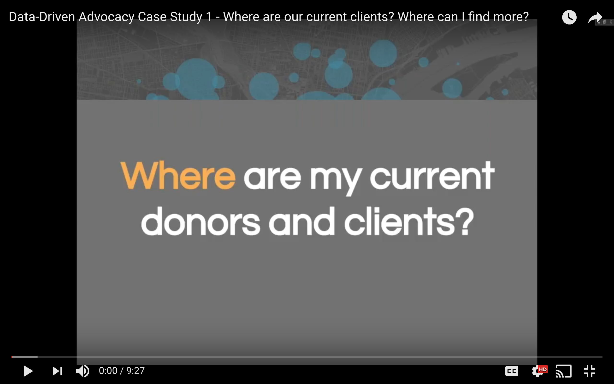
Case Study: How to Map Nonprofit Donors and Clients
Our Data Analytics Team produced a webinar series on Data-Driven Advocacy for Nonprofits. The 3rd webinar, 5 questions you can answer with maps and data visualizations, is now split into 5 short videos, one on each question. This post covers the first video, including details of a case study. Where are my current clients and donors? Where can…
-
5 Questions You Can Answer with Maps and Data Visualizations
The Azavea Data Analytics Team is holding the last installment of the Map Readiness webinar series on March 22nd, 2017 from 2-3pm EST. We’llВ walk you through the analytics techniques and tools we use to help our nonprofit partners answer their biggest questions. Optimize Your Nonprofit As you may know, we at Azavea’s Data Analytics Team…
-
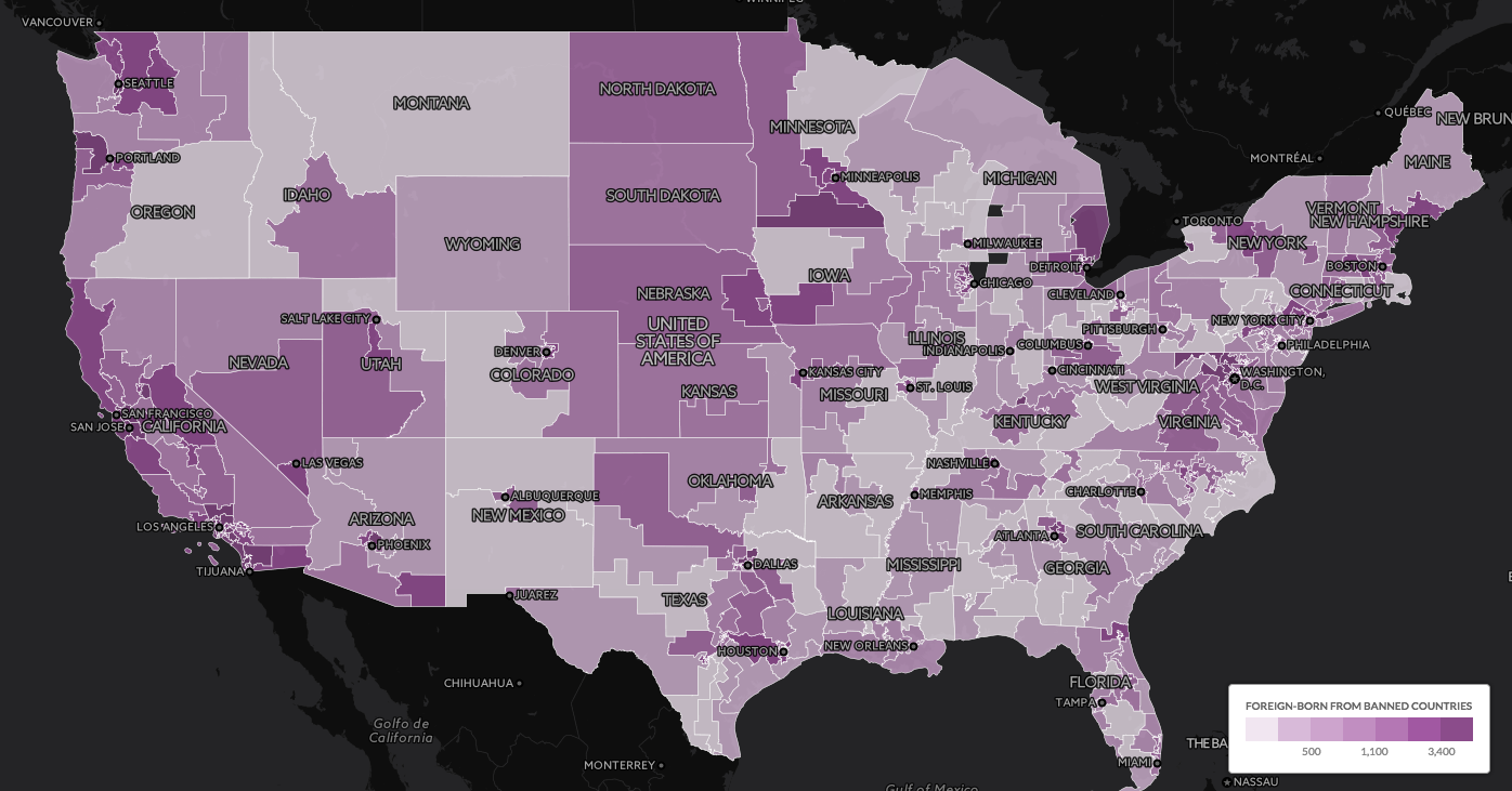
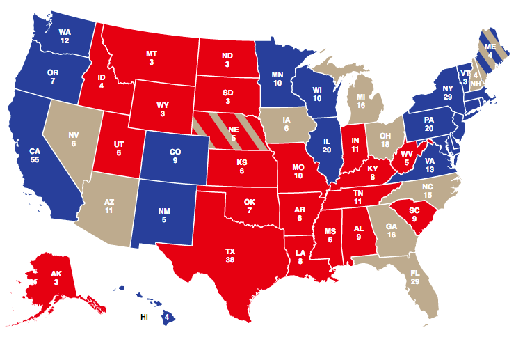
5 Election Results Maps You Need for Election Day
This post details 2016 election maps to watch on election night.
-
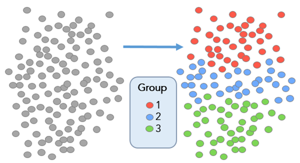
Defining Communities with ESRI’s Grouping Analysis Tool
In this post, we discuss how to define communities with ESRI’s grouping analysis tool, a powerful method aiding with data comprehension.