Wildfires in the U.S. are becoming larger and more destructive driven by climate change, a century of forest mismanagement, and increasingly more construction in fire-prone areas.
Since 2019, our team has contributed to Wildfire Risk to Communities, a free resource by the USDA Forest Service and Pyrologix in partnership with Headwaters Economics. Element 84 designed and built the site’s Explore web application that makes the latest advances in wildfire simulation modeling available to the public. Users can find any community, tribal area, county, or state in the nation, explore interactive risk maps to understand wildfire risk in their area, and find resources to help reduce risk. The tool incorporates data on vulnerable populations to direct risk reduction efforts towards the most vulnerable and directs users to tailored resources to take action in their community.
We are proud to support Wildfire Risk to Communities as it is clear to us that tools like it are only becoming more important over time.
Making wildfire risk information and tools available to everyone in impacted communities means that they must be as easy to use and accessible as possible. Web accessibility is especially important to ensure that individuals with disabilities are able to access crucial information easily. Twelve million individuals in the U.S. have a color vision deficiency (also known as color blindness), and more than seven million individuals regularly use a screen reader to access content online. Additionally, all government-funded software needs to satisfy Section 508 standards, which require federal agencies to “make their electronic and information technology (EIT) accessible to people with disabilities.” Ultimately, making accessibility a priority in this project contributes to equitable wildfire risk reduction efforts across the country.
Our web application accessibility process
In partnership with the U.S. Forest Service and Headwaters Economics, we are continually working to ensure that the application is as easy to use as possible to maximize the impact for our users. Recently, we completed a redesign of the tool (release date coming soon!) based on comprehensive usability and accessibility testing.
Our strategy for centering accessibility
As a small company we currently don’t have a full-time accessibility expert on staff. Instead, we’ve developed a strategy to ensure that accessibility is a core priority within all of our work.
Strategies for centering accessibility:
- Consider accessibility from the start — in proposals, contracts, and designs
- For older codebases where accessibility has not been a priority in the past, complete an accessibility audit and resolve as many issues as we can in-house
- Have continued accessibility learning and train engineers to consider accessibility best practices with all of their work
- Validate our work through follow-up testing with a dedicated accessibility specialist
Ultimately, our accessibility testing process does shift organically based on the specific project we are working on.
How we do accessibility testing
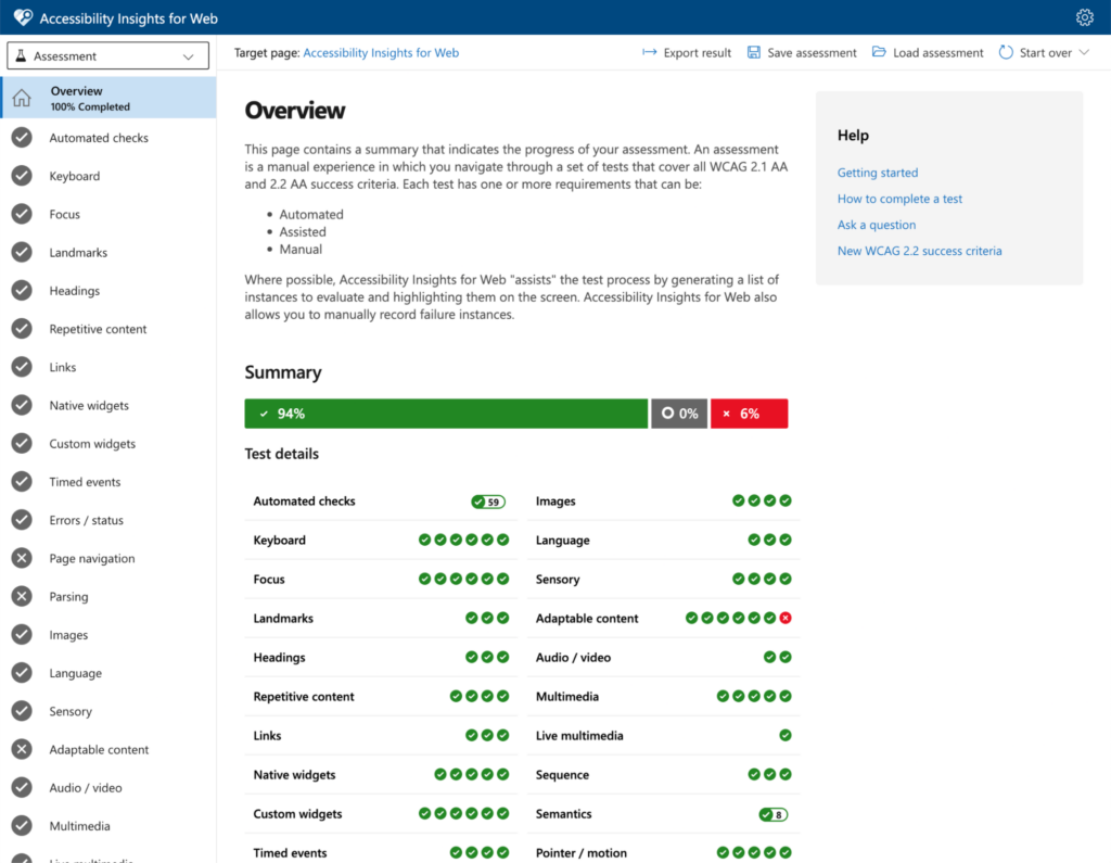
We began our audit of the Wildfire Risk to Communities’ Explore application with Accessibility Insights for Web, a suite of 50 automated checks and 20 manual tests to verify that a web app is compliant with Web Content Accessibility Guidelines (WCAG) 2.1 Level AA. WCAG is the widely-accepted standard for web accessibility as defined by the World Wide Web Consortium (W3C).
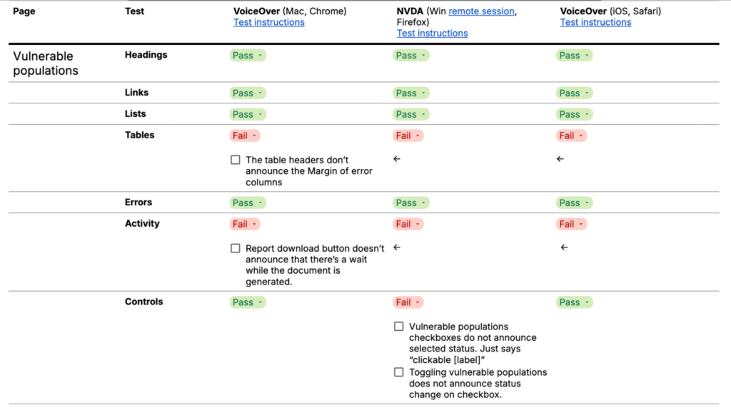
Additionally, we conducted a comprehensive screen reader test of the web application. We followed a structured testing approach (introduced here by Ross Mullen of Canaxess) that ensured our efforts focused on the critical parts of the digital experience and remained reproducible across screen readers and devices.
Any test is a tradeoff of comprehensiveness and budget. In this project we tested using the screen readers NVDA in Firefox on Windows (via remote session), as well as VoiceOver in Chrome on Mac OS and Safari on iOS.
Challenges and solutions for web application accessibility
Based on our findings, we designed an improved, accessibility-focused design system for the application that adds focus styles for each interactive element, improves hierarchy and consistency of typography across the application, and increases color contrast in a few elements where it was lacking.
Many of our tools are single-page React applications that excel for data-heavy apps but require retrofitting some of the native browser accessibility features, such as announcing page or state changes to screen readers after the user presses a button or link. Similarly, as we develop custom solutions tailored to complex datasets, we often implement user interface components using third-party component libraries or from scratch. The W3C ARIA APG Pattern library was a helpful resource to ensure custom components follow the latest accessibility patterns.
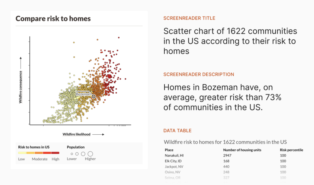
Data visualizations are visual by default. To make them accessible to screen readers we added alt text for all charts, which is an accessible description that is read out by screen readers so users can hear and understand the visual content. Each chart now has a description that changes dynamically based on the selected location. It describes the type of chart, the type of data and (on a high level) the main takeaway. Additionally, the chart provides the represented data in tabular format for screen readers.
Map accessibility
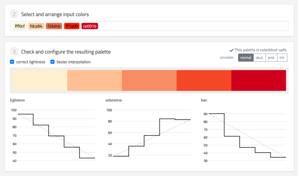
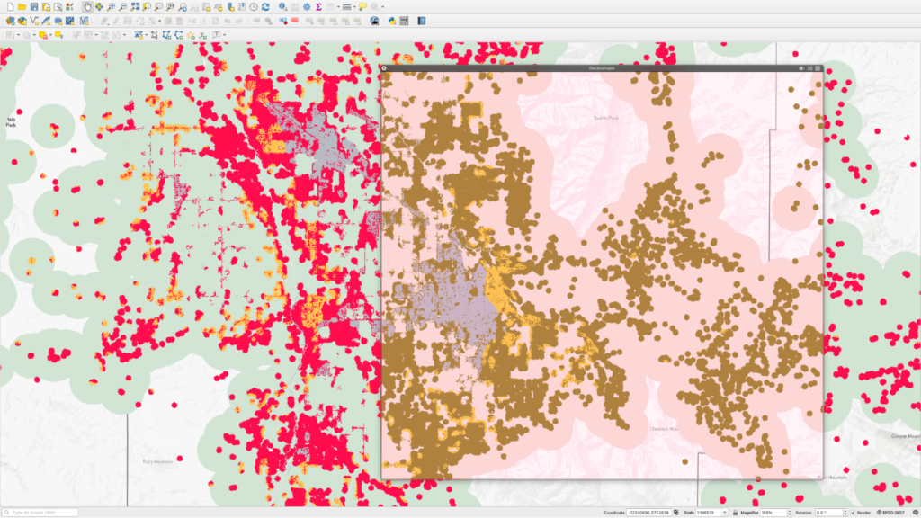
Creating accessible maps starts with designing maps focussed on the purpose at hand, removing distracting elements, adding a legend, and choosing an accessible color palette. Our designers like to use the Chroma.js Color Palette Helper to tweak color scales for accessibility, and use Sim Daltonism to quickly test for various types of color blindness when working in tools like QGIS.
Dynamic captions for risk maps
Beyond the basics, web map accessibility is difficult to implement. Web maps in our projects are usually highly dynamic/interactive, which can be difficult to describe using alt text, and canvas/Web GL-based map libraries don’t expose HTML elements to the browser that a screen reader could interact with. Most web map libraries fail a number of WCAG tests.
A common recommendation for improving map accessibility for screen readers is to provide a tabular alternative to the visual data on the map, even though this approach has diminishing returns as the complexity and amount of the visualized data increases. A table can reasonably list public restroom locations in Manhattan but raster data of wildfire risk across a county is difficult to represent in tabular format in a way that’s both intuitive and computable for any location in the nation.
Maps in Wildfire Risk to Communities help the user compare risk levels within the selected location (e.g. identifying higher wildfire likelihood in the eastern part of a county). To extend this capability to blind users in the future, we hope to explore integrating more detailed summaries, such as breaking down the risk level by neighborhood or other municipal region. Here, factors to consider include the technical complexity (requiring pre-computed or on-the-fly geospatial analysis on a server) as well as the resolution of our risk models.
For now, our redesign labels every map with an accessible description that summarizes the visual, making it possible for screen readers to describe the map to unsighted users at a high level.
Keyboard navigation for census tracts
The Vulnerable Populations tab lets users consider information about people with demographic or economic factors that may make them more vulnerable to wildfires. The interactive census tract map can now be fully navigated by keyboard and screen reader. This makes it possible to select a census tract on the map and look up statistics about vulnerable populations living there, whether you’re using a mouse cursor or not.
Our approach was inspired by several experiments by designers at Mapbox and the (now discontinued) Mapbox GL Accessibility plugin. We first experimented with a crosshair approach to select census tracts.
Ultimately, we arrived at an approach that makes it possible to tab through a list of tracts by keyboard. As the user focuses on a census tract, the map pans to the selected census tract and the screen reader announces the tract name. By pressing the Enter key, the user can bring up the vulnerable populations table for the selected tract.
Our findings after conducting web application accessibility tests
To improve the overall accessibility for users of Wildfire Risk to Communities, we completed an accessibility audit described above. We updated the application to follow the latest accessibility best practices and enhanced the accessibility of charts and maps across the tool.
Repeating the audit after making these enhancements validated that we resolved all but a few issues, most of which were out of our immediate control. We raised the site’s passed test rate for WCAG 2.1 AA compliance from 77% to 96%. Since the Section 508 standards require compliance with WCAG 2.0 levels A and AA, this means the enhanced application exceeds the accessibility requirements for federally-funded projects.
Although there are always further enhancements we can make, we are confident that this effort makes it easier for users of assistive devices across the U.S. to access crucial resources to understand and reduce their wildfire risk. We look forward to continuing to improve the application.
To learn more about our work on climate-related issues, and to discuss how our team might be able to help you solve a related problem, get in touch with us!