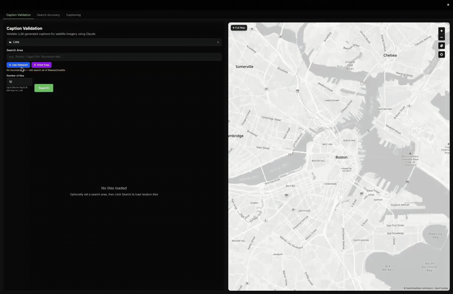
At Element 84, weвҖҷve been exploring how LLMs can improve geospatial imagery search. We recently published a blog post detailing our latest updates to our Queryable Earth demo which lets users search for visible features on the Earth using natural language. Until recently, it relied entirely on SkyCLIP, an open-source vision-language model, to generate the vector embeddings that power the search. We wanted to test a different approach using multimodal LLMs, like AnthropicвҖҷs Claude, to generate captions and then embed the caption using a text embedding model. Given the huge advancements in LLMs these modern LLMs can produce captions that encode richer descriptions than SkyCLIP and produce better results.
In this post we detail how we used Claude Haiku, and more recently Claude Opus, to caption Queryable Earth tiles. We also share the tools we use for validating our results and comparing the embeddings generated by SkyCLIP, Haiku, and Opus.
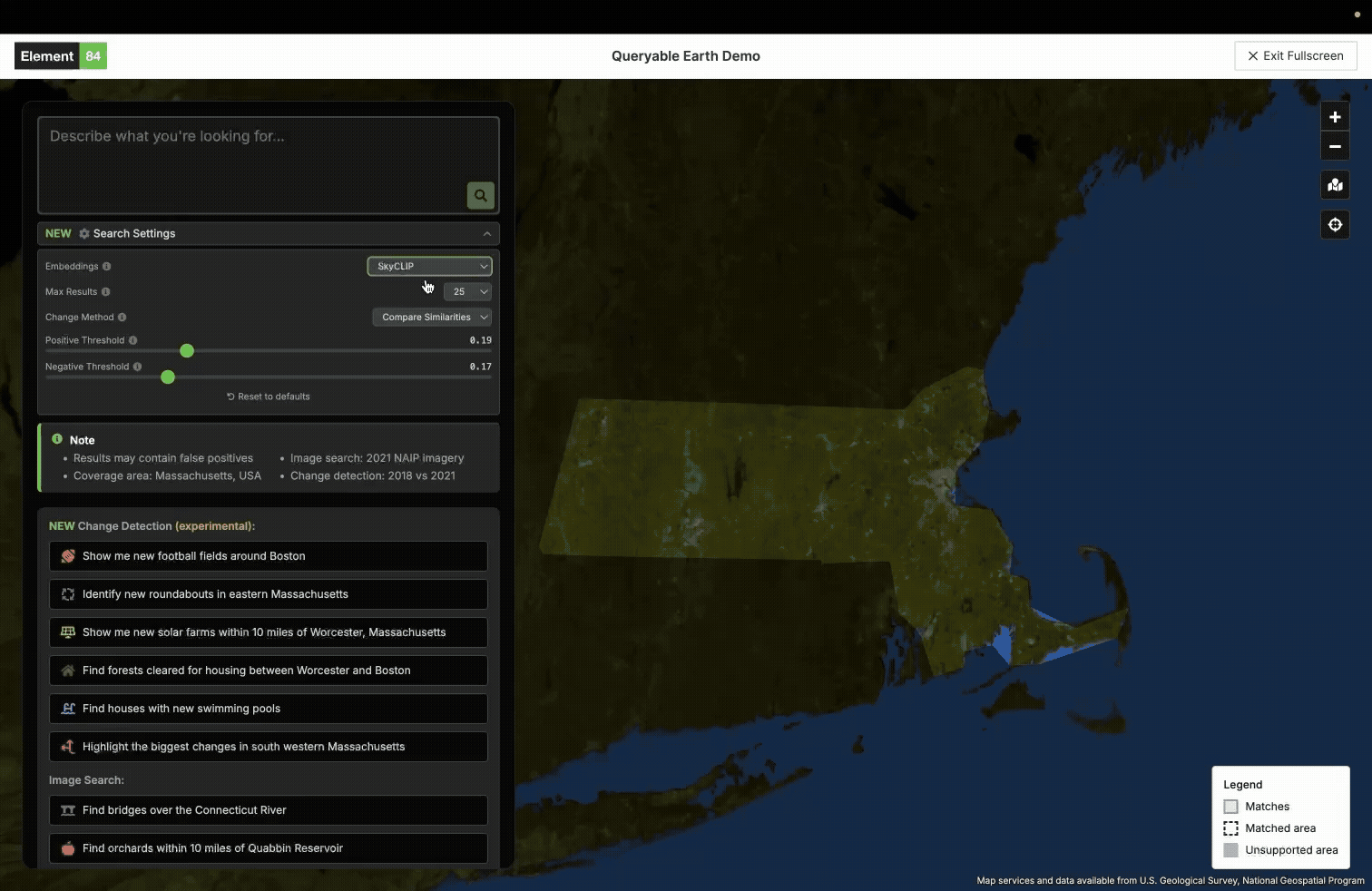
An example of using the new LLM embeddings in our queryable earth demo.
Our preliminary process: using SkyCLIP to build vector embeddings
When we first built Queryable Earth, we used SkyCLIP, an open-source vision-language model trained on geospatial imagery, to generate vector embeddings for each tile. These embeddings allowed users to search for visible features on Earth using natural language by matching query embeddings against image embeddings.
SkyCLIP was a strong starting point. Its open weights and relatively low cost made it practical to run at scale, and it produced useful results for many common queries. However, we began to see limitations when extending the system to more complex tasks, particularly change detection and queries requiring more detailed semantic understanding. For example, we noticed SkyCLIP sometimes missed smaller or more specific features, such as helipads or overpasses.
This led us to explore an alternative approach: rather than embedding images directly, we could instead first generate natural language captions using a multimodal LLM (e.g., Haiku, Opus), and then embed those captions using a text embedding model.
The intuition behind this shift is straightforward: modern multimodal models have demonstrated strong performance on general visual understanding tasks, and can produce richer, more flexible descriptions than a model trained on a fixed geospatial dataset.
Here were some of the challenges and questions we thought about when planning this new LLM approach:
- Cost: captioning hundreds of thousands of high-resolution tiles with an LLM is significantly more expensive than direct embedding with a model like SkyCLIP.
- Model selection: smaller models like Haiku are much cheaper, but may miss important details compared to larger models like Opus.
- Caption quality: retrieval performance depends heavily on whether the model captures the right level of detail.
- Domain generalization: whether a general-purpose multimodal model can outperform a model like SkyCLIP that was trained specifically on Earth observation imagery.
- Image Quality: How does the difference in image quality affect the quality of LLM captions? For example there is a noticeable difference between the shading of imagery between 2018 and 2021 for NAIP imagery.
To answer these questions, we built a validation framework to evaluate LLM-generated captions and their resulting embeddings across three dimensions:
- Caption accuracy on a curated benchmark.
- Retrieval performance in the Queryable Earth demo.
- Where different models agree or disagree on the same imagery.
WeвҖҷll start by describing how we built the LLM-based captioning and embedding pipeline.
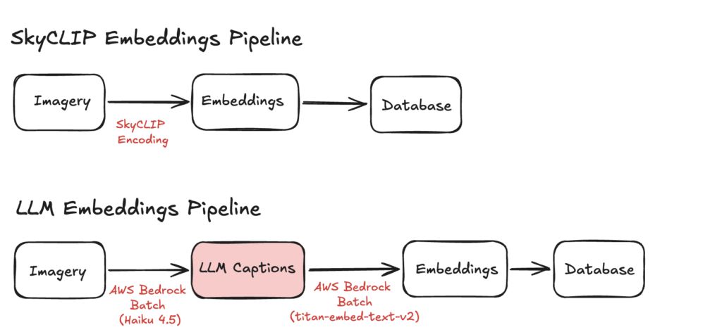
Pipeline Architecture
SkyCLIP Pipeline
Our original SkyCLIP pipeline consisted of three main steps:
- We divided NAIP imagery for Massachusetts into hundreds of thousands of 240 m x 240 m tiles using the Raster Vision library.
- We encoded each tile directly with SkyCLIP and stored the resulting embeddings in Parquet files.
- We ingested those embeddings into our database and built cosine similarity-based indexes to support fast retrieval.
At query time when a user enters a phrase like вҖңsolar panelsвҖқ, we encode that text into the same SkyCLIP embedding space and return the tiles with the highest cosine similarity. More recently we also implemented change detection using these embeddings, which you can read more about in our blog post.
LLM Pipeline
The LLM-based pipeline follows the same overall pattern, but introduces an intermediate captioning step:
- We generated the same set of Massachusetts imagery tiles used in the SkyCLIP pipeline.
- We encoded each tile as a PNG, converted it to base64, and stored those payloads in Parquet files for batch processing.
- We used AWS Bedrock batch inference to generate captions for each tile using a multimodal LLM.
- We used AWS Bedrock batch inference again to embed those captions using a text embedding model.
- We ingested the resulting embeddings into our database for retrieval.
Validation Methods
Building the pipeline was only part of the challenge. We also needed a way to measure whether LLM-generated captions were actually useful for retrieval.
To evaluate that, we measured performance at two stages:
- Before embedding: by testing how accurately different models and prompts described geospatial imagery. This allowed us to select our desired model and refine our prompt before spending money to run the pipeline on our entire dataset.
- After embedding: by evaluating how well the embeddings performed in Queryable Earth, and how different models compared to each other by measuring similarity between their representations of the same tiles.
Before Embedding: Caption Benchmark
Our first validation method was a benchmark designed to measure captioning accuracy on geospatial imagery.
Before running captioning at scale, we needed a consistent way to compare different models and prompts. To support that, we built an internal tool for collecting benchmark imagery, generating captions, and reviewing graded results.
The benchmark workflow had four steps:
- Select imagery tiles either interactively through the tool or by importing them from other workflows. We intentionally included both representative examples and tiles that earlier model runs struggled to describe correctly.
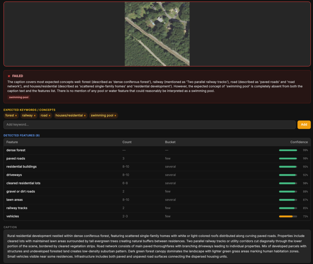
- Label benchmark tiles with the key concept we wanted the model to identify (for example, solar panels or swimming pools).
- Generate captions using the model and prompt configuration under evaluation.
- Grade the captions using a second LLM based on whether they captured the intended concept. For example, if the target concept is solar panels and the caption says photovoltaic arrays, that should still count as correct for embedding purposes.
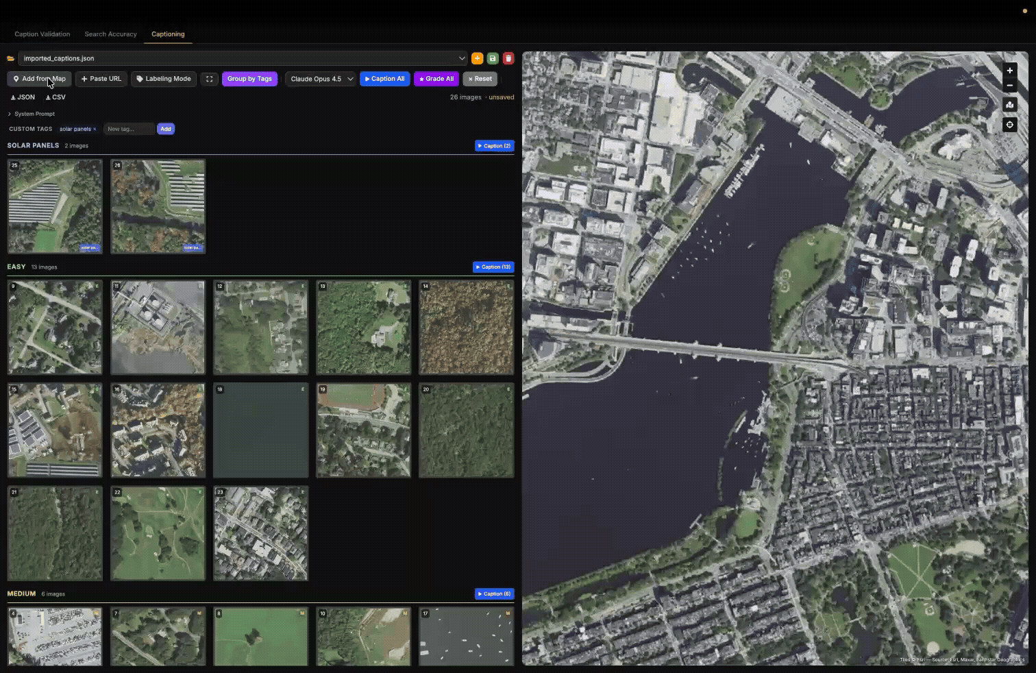
An example of using our internal Caption Benchmark tool for finding a tile, labelling it вҖҳbridgeвҖҷ and вҖҳeasyвҖҷ then adding it to this example benchmark. Then we caption the tiles in the benchmark using our selected model, and grade them.
This benchmark was also useful for prompt iteration. Some of the changes we tested included:
- Instructing the model to focus on certain classes of features (e.g., infrastructure, bodies of water).
- Including latitude and longitude in the prompt.
- Discouraging boilerplate phrases such as вҖңthis aerial image showsвҖҰвҖқ.
- Discouraging descriptions of absent features.
The results below show caption benchmark accuracy for three Anthropic models across our set of 70 carefully selected tiles. (Higher is better)
| Model | Accuracy (without lat/lon in prompt) | Accuracy (with lat/lon in prompt) |
| Haiku | 56% | 57% |
| Sonnet | 67% | 69% |
| Opus | 86% | 94% |
*Because this benchmark was intentionally skewed toward difficult imagery, these scores should not be interpreted as overall retrieval accuracy in the demo.
The most notable result was the jump from Haiku and Sonnet to Opus. While Sonnet showed only a modest improvement over Haiku, Opus produced a substantially larger gain in caption accuracy. Additionally, we found that including latitude and longitude in the prompt made a noticeable increase in accuracy, especially in Opus.
That said, model quality came with a cost tradeoff. Sonnet was roughly 3x the cost of Haiku, and Opus roughly 5x. In our pipeline, that came out to roughly 0.00174 cents per tile for Haiku and 0.0087 cents per tile for Opus. For the initial Queryable Earth deployment, Haiku was used because it offered the best balance of cost and quality for testing the viability of the pipeline. More recently, we also ingested embeddings generated from Opus captions to evaluate whether the additional accuracy justified the higher cost.
More importantly, this benchmark gave us a repeatable way to evaluate new prompt strategies and current or future multimodal models.
An example of a caption being marked wrong because it has no mention of “swimming pools”.
Post-Embeddings Validation Methods
After generating embeddings, the next step was measuring how well they worked in practice. We were interested in two things:
- Query-Level Retrieval Evaluation: how well Queryable Earth could use SkyCLIP, Haiku, and Opus embeddings for imagery search and change detection.
- Large-Scale Validation: how these different approaches behaved across real geographic areas beyond the benchmark. We used sampling methods and full dataset embedding similarity comparison between different embedding methods.
To evaluate this, we developed a couple complementary approaches.
Query-Level Retrieval Evaluation
To evaluate retrieval quality of the embeddings, we needed an automated way to check whether the imagery tiles returned by Queryable Earth were actually good matches for what the user searched for.
We used Opus as the grading model for this automated system because it performed strongly in our caption benchmark. While it is not a perfect substitute for human review, it gave us a practical and scalable way to compare retrieval results across different embedding approaches, with manual review always an option for surprising or ambiguous cases.
We implemented an automated evaluation pipeline with the following steps:
- Define a set of queries spanning both imagery search and change detection use cases.
- Send each query to our internal Queryable Earth API using different embedding backends (SkyCLIP, Haiku, and Opus).
- Pass the returned results to Opus with a grading prompt asking whether each result matches the original query.
- Store the graded outputs for analysis and comparison.
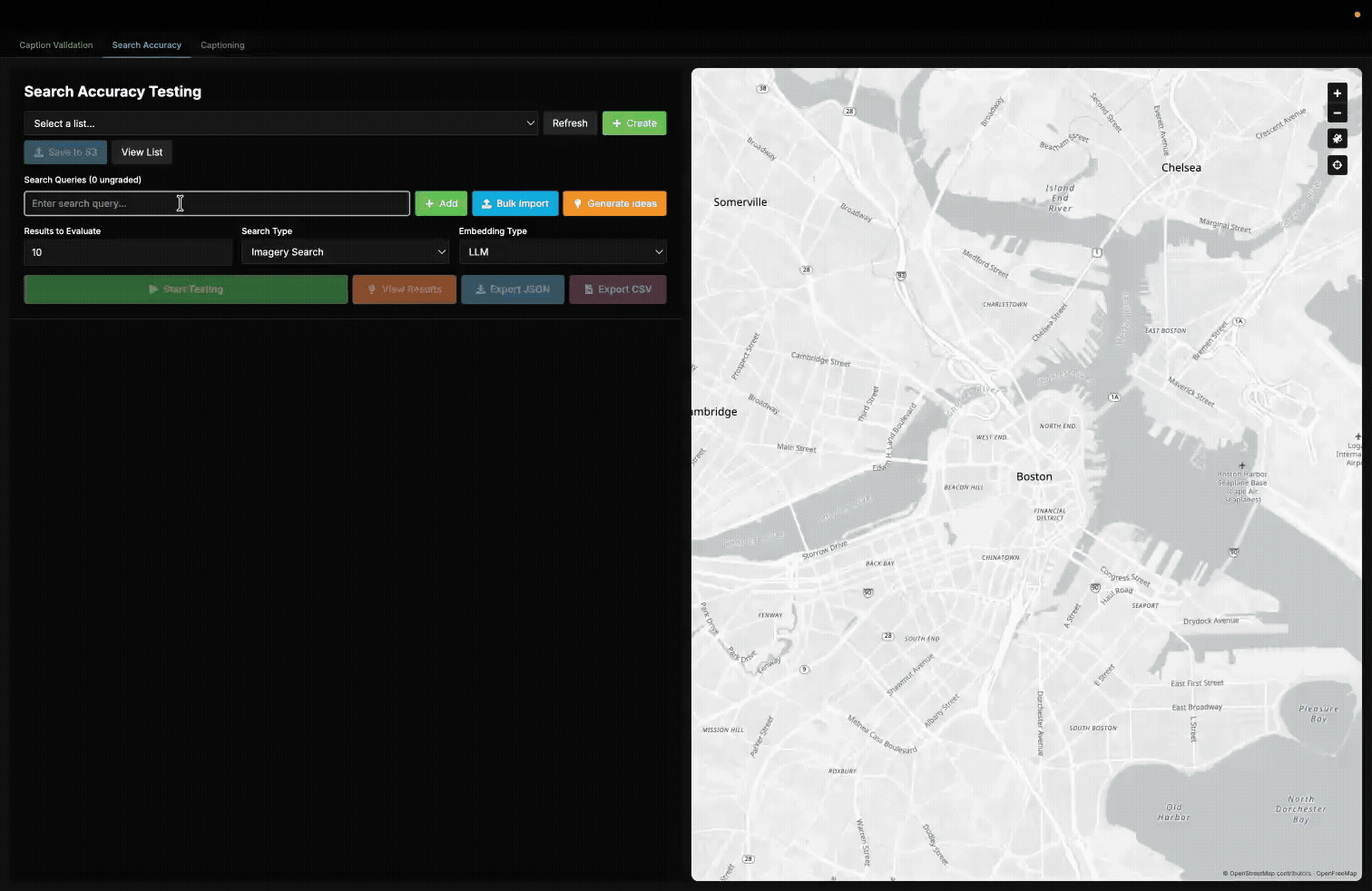
A demonstration of our internal validation tool used to measure the accuracy of queries in our queryable earth demo.
Running this across over a hundred queries allowed us to compare retrieval performance across models and use cases:
| Average SkyCLIP score: | Average Haiku Score: | Average Opus Score: | |
| Complicated Change Detection Queries | 55.45% | 32.73% | 55.00% |
| Simple Change Detection Queries | 50.00% | 43.93% | 56.07% |
| Imagery Search | 71.79% | 55.73% | 77.18% |
| Total: | 64.22% | 49.19% | 68.75% |
This query set is not meant to represent every possible search, but it gives a useful sense of how the different embedding approaches perform in practice. For imagery search, on average 71% of the top 10 results returned by SkyCLIP were relevant, compared to 55% for Haiku and 77% for Opus. Performance generally dropped on rarer or more complex queries, where relevant imagery was either less common in the dataset or harder for the model to identify.
For change detection, we grouped queries into simple cases such as вҖңnew solar panelsвҖқ or вҖңnew quarriesвҖқ, and more complex cases such as вҖңhillsides stripped for miningвҖқ or вҖңsuburban sprawl encroaching into farmland.вҖқ SkyCLIP seemed to perform slightly better on complicated queries than Opus.
Haiku often failed to pick up certain types of objects like wind turbines, land fills, vineyards, and power substations that the other models picked up on. On the other hand Opus and SkyCLIP were largely comparable, with Opus standing out over SkyCLIP on things like imagery of helipads, terraced farmland, and overpasses. While Opus was overall better for this retrieval, SkyCLIP did outperform Opus in certain areas such as identifying mangroves, hydroelectric plants, and cargo ships.
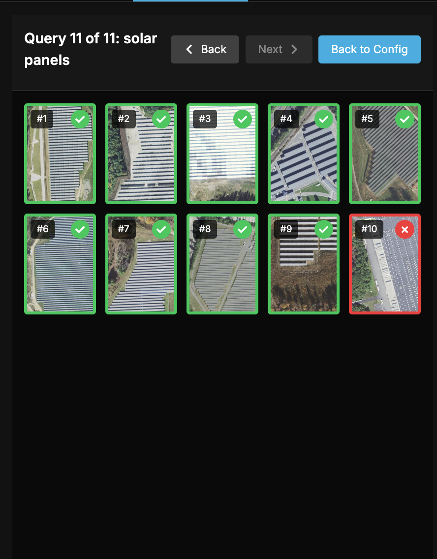
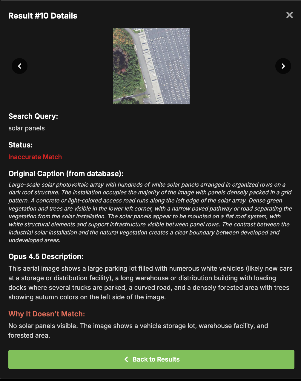
An example of a graded query and a result marked wrong because it did not contain solar panels in it.
Query Level Findings
The key findings were:
- Opus consistently outperformed Haiku across all categories.
- SkyCLIP remained competitive, particularly for more complex change detection queries.
- Haiku showed the largest performance gap overall.
Large scale validation of embeddings
The caption benchmark gave us a controlled way to compare models on a curated set of difficult tiles, while our query-level retrieval evaluation helped us measure how well the resulting embeddings performed in Queryable Earth. However, there are still some gaps, like how models behave across different geographical locations at scale, like metropolis, suburban, and rural areas.В
To fill in those gaps, we needed a way to evaluate performance across larger or specific regions and inspect how caption quality varied across different types of landscapes and scene complexity.
We came up with two ways:
- Sampling and grading Haiku captions with Opus: we used Opus to grade Haiku captions across sampled geographic regions. We could not apply this same method to Opus, since it would be grading its own captions, or to SkyCLIP, since SkyCLIP does not produce captions.
- Embedding similarity analysis: we compared how similar the embeddings were for the same tile across models. Areas of strong disagreement often pointed to scene types where certain models struggled more than others. This method allows us to compare all three embedding types to each other.
Sampling and grading Haiku captions with Opus
This approach was to randomly sample Haiku-captioned tiles within a selected geographic region and evaluate their captions using Opus as a grader. While not perfect, it provided a practical way to evaluate large numbers of samples, and we could adjust the grading prompt depending on what we wanted to measure (e.g., missing small details vs. major scene understanding).
This allowed us to:
- Identify regions where Haiku struggled.
- Compare performance across different types of environments.
- Understand how caption quality varied at scale.
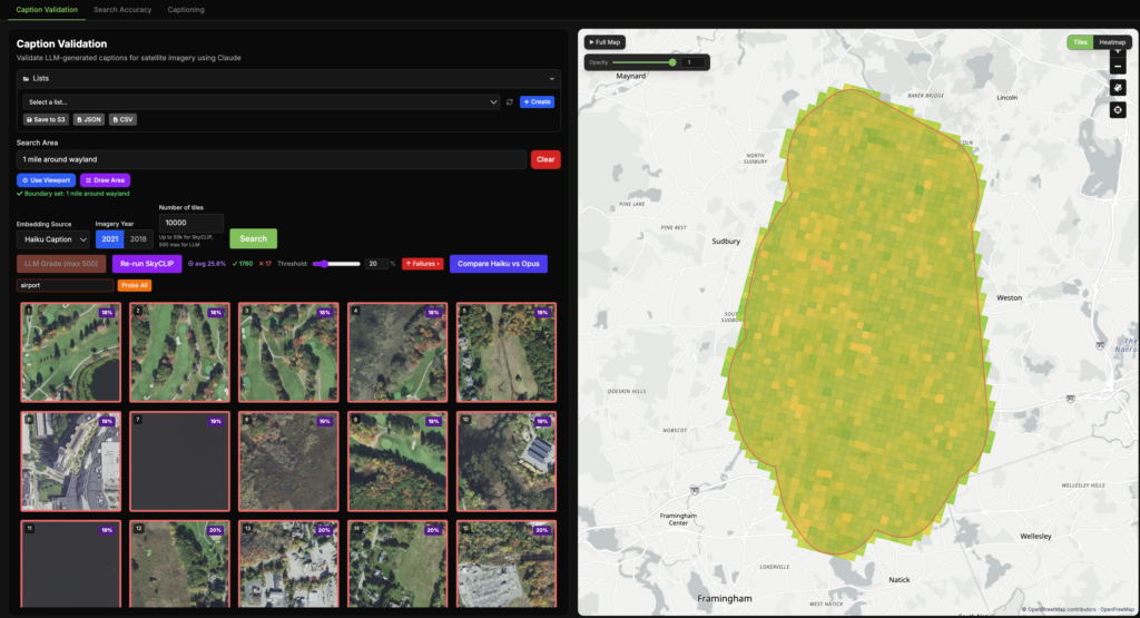
Example of selecting areas in different ways with our Caption Validation tool, then grading the Haiku caption of 10 randomly selected tiles within Boston.
Where Haiku Struggled
This approach revealed patterns for Haiku that were not obvious from the benchmark alone. We found that Haiku often missed smaller or more detailed features in complex scenes that Opus was able to capture more reliably. This was especially noticeable in dense urban areas, where features such as construction sites and rail lines were sometimes omitted.
The model also occasionally missed smaller objects in other environments, including:
- Swimming pools and small solar installations on buildings.
- Small structures in forest-dominated areas.
- Fine-grained infrastructure details in forests, like transmission lines.
This helped us answer several questions:
- Were certain areas harder to caption accurately than other areas? Could we potentially target harder areas with a better model?
- How effectively a stronger LLM can be used to evaluate the outputs of a weaker model at scale, without needing to run the full pipeline with the stronger model.
- How accurate are our captions now that weвҖҷve captioned 750,000 images beyond our benchmark test?
Measuring where the embeddings agree and disagree on the same tiles with cosine similarity
While our sampling-based evaluation helped us inspect caption quality in selected geographic areas with random sampling, we also wanted a way to directly compare how all the different models represented the same imagery, for every tile. To do that, we would need to measure the similarity between embeddings for the same tiles across models.
The challenge is that embeddings from different models live in different vector spaces, so they cannot be compared directly. To work around that, we embedded the LLM-generated captions into the SkyCLIP vector space, which let us directly compare the SkyCLIP embedding for a tile with the LLM-derived embedding for that same tile using cosine similarity.
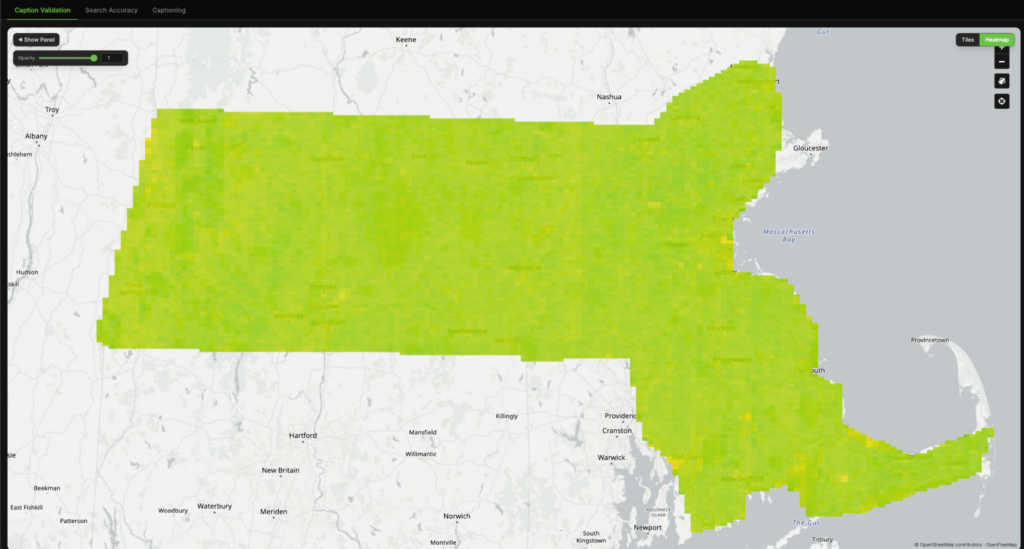
We applied this comparison across large geographic regions and visualized the results as heatmaps, where each tile is colored based on the similarity between the two representations.

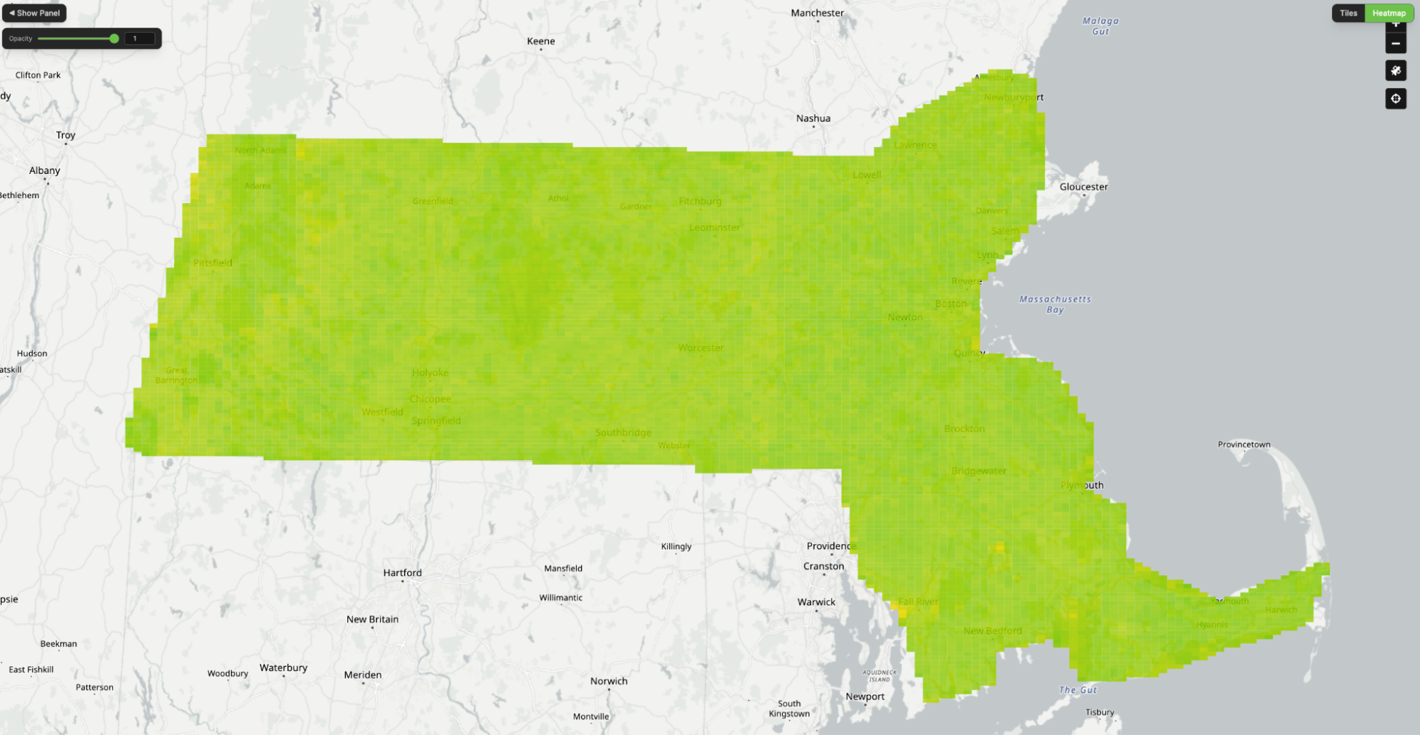
Using our validation tool to compare the similarity of our Haiku LLM embeddings with SkyCLIP.
Interpreting agreement
In the heatmaps, green indicates strong agreement between the two embeddings, yellow indicates partial disagreement, and red indicates a major mismatch in how the tile is represented.
In general, high similarity suggests that both models are encoding the same scene in a similar way, while low similarity indicates that they are emphasizing different features or interpreting the tile differently. In the example below, we can see a strong disagreement on a tile where Haiku described a golf course as an agricultural landscape – indicating that SkyCLIP labelled it correctly and Haiku did not.
To better understand these disagreements, we inspected the LLM-generated captions directly and also probed the SkyCLIP embeddings with specific query terms to see whether they aligned with the expected concept. In the example below, we probed the SkyCLIP embedding using the term вҖңgolf courseвҖқ and measured the cosine similarity. A score above roughly 20% is usually a strong indication of a match. In this case, the LLM caption did not identify the tile as a golf course, while the SkyCLIP embedding showed a strong match with “golf course”, suggesting strongly that the LLM-based embedding was wrong and SkyCLIP was correct.
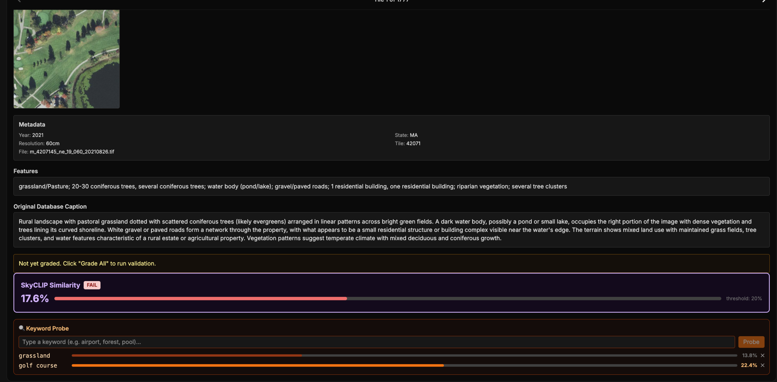
A cosine similarity heat map comparing Haiku and SkyCLIP, alongside a tile and its caption flagged as a major disagreement due to a cosine similarity below 20%. SkyCLIP embeddings were “probed” with the words “golf course”, which resulted in a high similarity match. The LLM caption not mentioning golf course and the probe resulting in a high match make it very likely that the LLM embedding was wrong and SkyCLIP was right in this case.
Embedding Similarity Across the Entire Dataset
Unlike grading with Opus, this overall process was very cheap, which allows us to run it across the entire dataset rather than a sampled subset. We created heatmaps for both Haiku vs SkyCLIP and Opus vs SkyCLIP, allowing us to compare how much each LLM-based approach agreed with SkyCLIP at the tile level.

Tile-level similarity heat maps comparing Haiku (left) and Opus (right) to SkyCLIP, based on cosine similarity between LLM-generated and SkyCLIP captions in SkyCLIP embedding space.
Notice that OpusвҖҷs heatmap on the right is overall more green.
Across the full dataset, both Haiku and Opus showed strong overall agreement with SkyCLIP. Most tiles had relatively high similarity scores, indicating that the models were usually representing the same imagery in comparable ways.
However, there was still a smaller subset of tiles with major disagreements (defined here as <20% cosine similarity). Out of approximately 350,000 tiles for 2021 NAIP imagery of Massachusetts:
- Haiku vs SkyCLIP produced 5,242 major disagreements
- Opus vs SkyCLIP produced only 1,435 major disagreements
We examined individual examples of these disagreements more closely.
Examples of major disagreements between Haiku and SkyCLIP (left) and Opus and SkyCLIP (right).
As seen in the examples above, the disagreements were not random. In both comparisons, they were concentrated in a few recurring scene types:
- Airports: frequently mischaracterized by Haiku, but much less often by Opus. These were often confused with road networks or agricultural landscapes.
- Golf courses: often confused by Haiku as agricultural land, while Opus almost always identified them correctly.
- Pure water tiles: a common failure case for Haiku, with fewer errors in Opus. In many of these cases the LLMs described the tile as forest or open fields.
- Autumn foliage: challenging for both LLM models. These were often interpreted as arid, scrubland, or desert-like landscapes.
When major disagreements occurred in these categories, the LLM-based embeddings were very often the ones that were incorrect, with SkyCLIP more often capturing the main theme of the scene accurately. This suggests that models like SkyCLIP still retain an advantage for certain classes of geospatial features that theyвҖҷve been thoroughly trained on.
One likely reason for some of the LLM captioning errors is limited spatial context. Many of these tiles become much easier to interpret when viewed with more surrounding area. Airports are a good example: a single tile may only show a fragment of a runway or tarmac that can be confused for a normal road, while a more zoomed-out view would make the larger pattern much more obvious. Perhaps if the LLM model was first given a broader view before captioning the tile, it would caption more accurately.
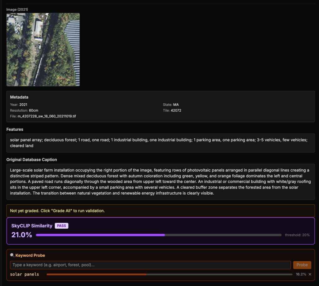
This analysis also surfaced cases where SkyCLIP appeared to miss smaller but important details, even when it was not obviously wrong at the tile level. In the example below, the tile contains solar panels, but the SkyCLIP embedding has only 16.2% cosine similarity with the term вҖңsolar panelвҖқ (for reference, a stronger match is typically around 20вҖ“26%). That suggests SkyCLIP likely failed to capture one of the tileвҖҷs main features. It still had a moderate 21% similarity with the Opus-generated caption, likely because it was matching the overall theme of the scene correctly.
Our retrieval results from earlier suggest that LLM-generated captions – mainly from Opus – were often richer and more semantically useful when they were correct. That likely helps explain why Opus performed better than SkyCLIP on imagery search: SkyCLIP was often better at capturing the general category of a tile, but it could miss smaller or more descriptive details that are sometimes more useful for matching natural language queries.
Taken together, this comparison gave us a much clearer picture of where each approach succeeds and fails. Rather than simply asking which model is вҖңbetter,вҖқ it helped us understand what kinds of scenes each model sees well – and where a combined or hybrid approach may be useful.
Key Takeaways: varied embeddings approaches within Queryable Earth
A few things stood out from this process:
- Opus and SkyCLIP consistently outperformed Haiku across both captioning and retrieval tasks.
- SkyCLIP remained strong in several areas, especially on scene types where geospatial-specific training appeared to matter more, such as airports and golf courses.
- SkyCLIP and LLM-based approaches showed different strengths. SkyCLIP was generally more consistent at capturing the overall theme of a scene, while LLM-based embeddings were more likely to make broader scene-level mistakes, but have richer captions.
- Opus generated captions were often more useful for natural language retrieval when they were correct, because they captured richer descriptions and smaller details that SkyCLIP sometimes missed.
- Opus significantly reduced many of the broader scene-level errors that appeared in Haiku, showing that higher-quality multimodal models can preserve more of the retrieval benefits of LLM-generated captions while avoiding more of the obvious failure cases.
- That evaluation framework is important and will continue to matter as models improve. It gives us a way to measure whether newer approaches are actually improving the system, understand the strengths and weaknesses of different models, and determine whether the added cost is justified – while also helping point toward where hybrid approaches may be useful.
What we want to explore next
This initial work gave us a strong starting point, but there are still several directions we want to explore next:
-
Test more multimodal models
Most of the work in this post focused on Anthropic models. A natural next step is to compare them against newer multimodal models from Google and OpenAI to see how they perform on the same benchmark, retrieval tasks, and tile-level comparisons. -
Train a smaller model on OpusвҖҷs output
One direction we are interested in is using a stronger model like Opus to generate higher-quality captions, then using those outputs to help train a smaller model that can directly embed imagery more efficiently. -
Compare different text embedding models
In this work, we focused mainly on the image captioning side. Another open question is how much retrieval quality depends on the text embedding model used after caption generation. -
Experiment with more image context
Some of the failure cases we saw, especially for things like airports or other partial scene types, may be caused by limited tile context. We want to test whether giving the model a larger surrounding view or multiple zoom levels improves caption quality.
If youвҖҷve been using Queryable Earth, or if you have thoughts on the approaches shared in this blog, weвҖҷd love to hear from you! We are continuing to iterate and build on our work in this space and we look forward to collaborating with members of the community as we continue to refine the process. Stay tuned for future updates on Queryable Earth and Natural Language Geocoding, and feel free to check out the full demo here.