If there is one design principle that I think folks working in the climate space need to consider, itвҖҷs вҖҳappropriate complexityвҖҷ – a concept I learned from Don Norman. I had the chance to share this concept while at New York Climate Week at the end of September, at an event focused on open data in applied risk analysis facilitated by Pricilla Cole from Geospatial Risk. As a designer, I was excited to share insights surrounding the importance and relevancy of data visualization in the risk analysis conversation. In this blog I detail a few case studies to demonstrate the importance of appropriate complexity and how it can contribute to meaningful action when applied with intention, particularly in the context of risk analysis.
Understanding appropriate complexity in design
Regardless of whether or not it is in your job description, everyone designs. Every time you engage in attempts to change things for the better, youвҖҷre designing. Further, itвҖҷs easy to forget that everything we use on a daily basis was, at some point, designed in order to help users to achieve a specific goal.
When it comes to television remotes, for example, different brands have run the gamut of over and under-simplified designs, neither of which are functional for users at their extremes. While a super simplified remote may fail users because it adds unnecessary clicks, a remote with 56 buttons has a lot of unnecessary actions that users may never actually use. A streamlined and intentional design, even one that is not flashy or particularly unique, represents an important concept known as appropriate complexity.
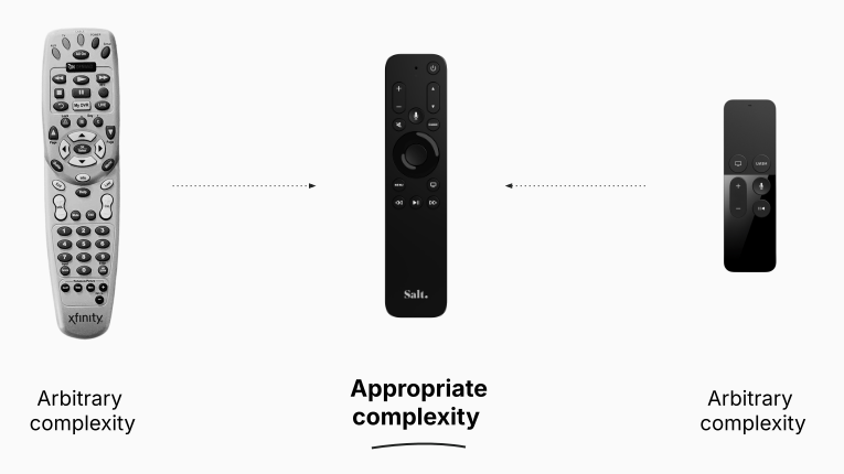
Originating from Don Norman in his book вҖңLiving with ComplexityвҖқ, appropriate complexity refers to the idea that complexity is a vital part of the world, not the enemy. Norman believes that the widespread desire for absolute simplicity in technology is a fallacy and, instead of seeking simplicity for its own sake, he believes we should strive for good design that can effectively tame and manage complexity.
When it comes to the remote, both extremes create arbitrary complexity; either by adding every button possible and making navigation a nightmare, or by taking away buttons to the extent that lowering the volume requires turning on the lights and interrupting your show.
This framework is crucial when it comes to good design. Good design is not about making things that are shiny, minimal, and cool. Rather, it is about efficacy and ease-of-use in real world scenarios. But, thatвҖҷs easier said than done. It isnвҖҷt hard to imagine map-based interfaces that fall into the trap of being too complex or too limited. There are often a lot of voices asking software engineers and designers for every possible action to be included in a given system. And, because of this, geospatial software is often built to resemble the remote with 56 buttons. It happens. But, designing well also doesnвҖҷt mean removing everything, rounding some corners and calling it a day.
I want our entire industry to be better equipped to call out arbitrary complexity and start getting to appropriate complexity. And, while designing in this way is a skill and craft that takes time to develop, I donвҖҷt think you need to be a Designer to do it.
Providing appropriate complexity to users
There are three primary ways for designers to provide appropriate complexity:
- Prioritize the usersвҖҷ вҖҳjobs to be doneвҖҷВ
- Match usersвҖҷ mental models
- Reduce usersвҖҷ cognitive load
Visualizing appropriate complexity design strategies with the Sitka Landslide Risk App
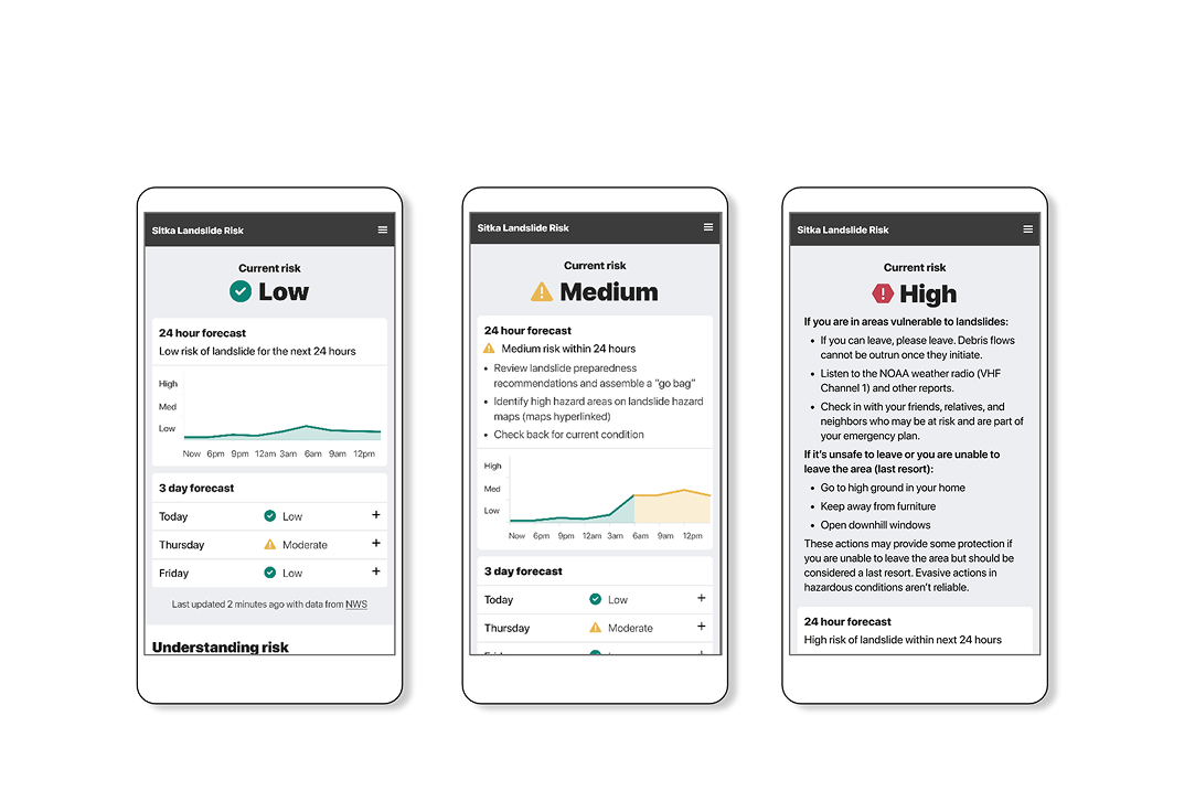
Sometimes, itвҖҷs easiest to see design principles through examples. The following case study demonstrates key strategies for implementing appropriate complexity. This project was undertaken after a series of deadly landslides hit Sitka, Alaska.В In response to these natural disasters endured by the affected community in Sitka, the driving goal behind the application is to save lives and to further landslide safety.В The work was spearheaded by the Sitka Sound Science Center, but involved collaboration with tribal groups, RAND Corporation, and several universities.В
The modeling behind the landslide application is quite complex and relies on state-of-the-art on-the-ground sensors. In spite of an undeniably complex system, our role in this project was to take that complexity and understand how we could communicate the core data clearly to users.В В
1. Prioritize usersвҖҷ вҖҳjobs to be doneвҖҷ
In other words, are usersвҖҷ end goals in alignment with the product or data you are building? The вҖҳJobs to be doneвҖҷ concept, or JTBD, grew from an evolution of customer-centric frameworks with contributions from Clayton Christensen and Anthony Ulwick in the 1990s. Unfortunately, a lot of systems are designed to further a short-term piece of the puzzle that is ultimately not useful to users.В
One example of this friction can be found in the difference between someoneвҖҷs desire to вҖңBe comfortableвҖқ vs their desire to вҖңCheck the weatherвҖқ before heading out for a picnic. Even though most people donвҖҷt want to be caught in the rain, which may lead them to check their weather app, the actual act of weather monitoring is not their end goal.
Although it seems subtle, if you forget users’ end goals you can easily create an arbitrary complexity by failing to answer the question they really aim to know, or the вҖҳjobвҖҷ they need to do. In the design process, itвҖҷs possible to test for this compatibility with a few simple evaluation questions.
Ask yourself:
- What do users ultimately need to do?В
- Does the user need to come to the conclusion on their own?В
- Is my user’s job to complete their own discovery, or just have answers defined?В В
Ask your users:
- What does done look like?В
- How would you know you completed your end goal?
Shifting responsibilities based on risk level
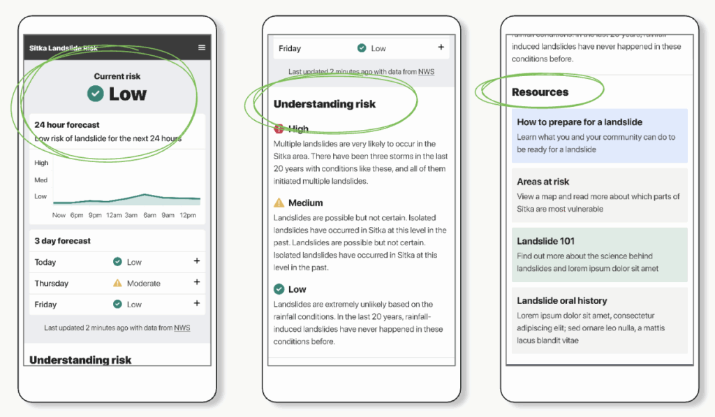
In the case of the Sitka Landslide Risk App, our user’s job was essentially just to stay safe вҖ“ it isnвҖҷt their job to check the risk. Further, when we begin to consider the level of risk itself, the usersвҖҷ job of staying safe doesnвҖҷt change.В That said, the actions they will need to take in order to maintain safety do change dramatically based on risk level.В
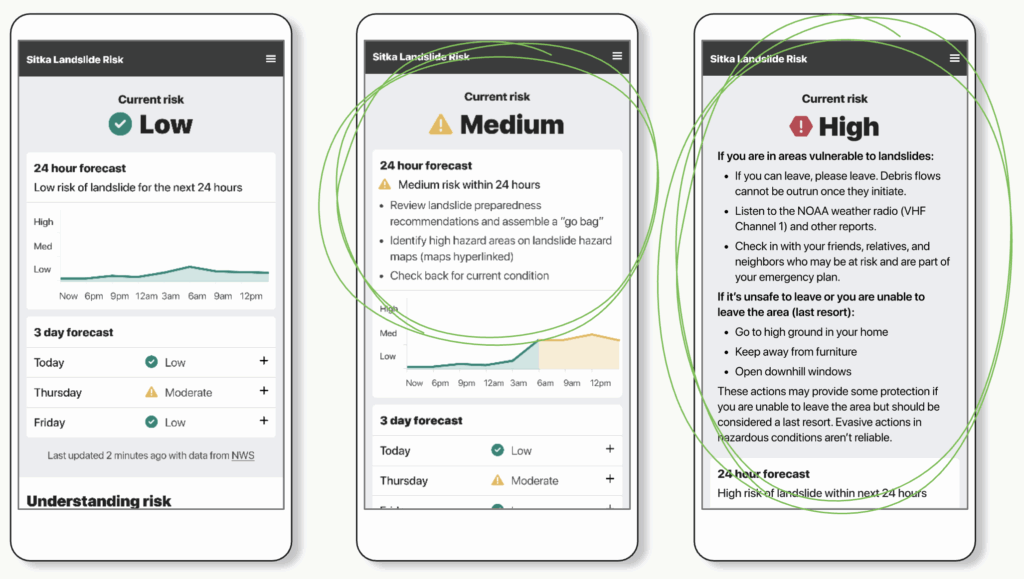
In this example you can see that as risk increases, so do the recommended actions. Because there is more that a user will need to do to stay alive, more information is shown in high risk scenarios.
Another вҖңjobвҖқ some users might be responsible for is making executive decisions about things like school closures or announcements on the radio. Users making these decisions donвҖҷt just need to know what the risk level is, they need to contextualize the risk to others and convey precisely WHY the risk is present while confirming the data itself. Even though this group represents a minority of users, their existence on the app requires a different type of data visualization.
In the design we prioritized risk level first. Even though in this format the data itself is not front and center, users that need additional context like rainfall amount and how it compares to past landslides are able to easily locate the information they need. By prioritizing data based on urgency and user needs, we are able to strike a balance between too much and too little, enabling users from all backgrounds to feel confident in a given scenario.
In a single interface, you can create spaces for users where appropriate complexity looks different.
2. Match usersвҖҷ mental models
Users generate mental models, even without realizing it, to more easily understand complexity. Although people have likely been doing this for much longer, the idea of a mental model was first popularized in the 1940s to convey how someone might imagine a tiny-scale model of how the world works to explain complicated ideas.
On your computer when you drag a file onto a small image of a trash can, the trash can graphic helps you understand that you can вҖҳput files in itвҖҷ to get rid of them вҖ“ just like the garbage in your kitchen. Even though this isnвҖҷt truly how the computer works, itвҖҷs a helpful metaphor вҖ“ a mental model!
Although it can be useful, this type of parallelism can break if itвҖҷs stretched too far. Think about back in the day when you had to eject a drive and you were supposed to drag it to the вҖңtrashвҖқ. At least for me, this always felt wrong. It breaks the mental model because if I want something back I donвҖҷt throw it in the trash.
There are a few easy questions you can ask yourself or your users to see if you hit the mark, or if youвҖҷre stretching a model too far.
Ask yourself:
- Does my work match how users already think about this?
- Did I create a new paradigm? Can I use a known one instead?
Ask your users:
- What would you need to be taught in order to use this system? В *Hint: the answer should be nothing!
While we worked on the Sitka Landslide Risk App it was extremely important to our stakeholders that it quickly conveyed info that keeps people safe. Users needed to feel confident and reassured.
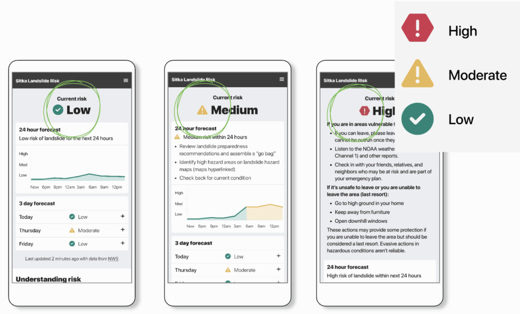
We tried a few different options, but ultimately leaned on a common pattern to indicate how they should behave: STOP, YIELD, or GO. This language unlocks a mental shortcut! Because users are able to relate our directions back to experience with common traffic signals, they donвҖҷt need to relearn a new way of thinking about risk.
3. Reduce usersвҖҷ cognitive load
When we talk about the cognitive load of an action, weвҖҷre referring to the amount of energy it takes to understand something. There are three main categories of cognitive load: intrinsic, germane, and extraneous. Intrinsic load involves the difficulty that comes with learning a new task, and it can be aided with intentional design. In contrast, extraneous loads involve external factors that might make it difficult to adopt a new skill. This concept emerged in 1988 and was spearheaded by John Sweller, a psychologist interested in understanding how people learn and how instructional design could impact that.В
Highway signs sometimes do a good job of removing extraneous load. When drivers are flying down the highway there are a lot of external factors to keep in mind, and it can be hard to process information. Separate signs break down some of this extraneous load. With one sign communicating the speed limit, one to let you know about upcoming exits, one to tell you about an upcoming detour, and more вҖ“ itвҖҷs easy for drivers to process that information in a distributed fashion, but it would be nearly impossible if it was all posted in one place. Highway signs are meant to be simple because we know that the available cognitive load of a driver is really limited, and for a good reason.
In the context of our Landslide App, our design communicates risk level first. This choice allows users to take in the most important piece of information first, and then they are able to allocate the appropriate amount of bandwidth to the rest of the resulting information. If the resource list or other details came first it would tax the user since the onus would be on them to determine their relative danger.
Ask yourself:
- Have I made information digestible in a real world context?
Ask your users:
- What information is important to you on this page? (watch out for anything that NONE of your users find important)В
Observe:
- What your users actually do in the real world, and shift your design accordinglyВ
Why does appropriate complexity in the disaster response and risk analysis field matter?
As weвҖҷve established, complexity itself is not the enemy. That said, there are several factors that inhibit processing for users. According to Dr. Gloria Mark, in 2004 the average attention span on a screen was about 2.5 minutes. By 2012 this metric had dropped to 75 seconds, and today average on-screen attention span is estimated to be around 47 seconds.В
On top of dropping attention spans, we are less able to react while under stress. Research focused on crisis situations shows that pilotsвҖҷ ability to respond to alarms or warnings during a difficult task or emergency is severely impaired. In one study, pilots missed over 50% of critical cues when their workload was high.
While we demonstrate delayed responses and shrinking attention, our world is experiencing more extreme climate events. According to the WMO, the number of disasters related to weather, climate, and water hazards has increased by a factor of five over the past 50 years (1970вҖ“2019). While improved reporting plays a role, climate change is cited as a primary driver. To limit warming to 1.5В°C, carbon emissions must be slashed 43% by 2030. Every year of high emissions depletes the carbon budget.В
As ongoing crises that limit our cognitive capacity continue, our ability to process complex data will also continue to decline. For these reasons, work being done in the disaster response and climate space is invaluable вҖ“ but only if it can avoid being arbitrarily complex and move towards appropriate complexity.
The more critical the data, the more important it is that itвҖҷs clear and actionable. Open data is the first step, but the well-designed dissemination of the insights it unlocks shouldnвҖҷt be an afterthought. If youвҖҷre already doing this work, or interested in applying these ideas, weвҖҷd love to connect with you! Send our team a note over on our contact us page, and follow along on our quarterly newsletter for more.В