All blog posts
<- View categories
-
How to Run GeoPySpark in a GeoNotebook with Docker
Walk through the easiest path to enable the use of GeoPySpark, a Python library for geoprocessing big data, interactively in a GeoNotebook with Docker.
-
How to Run GeoPySpark in a GeoNotebook with Docker
Walk through the easiest path to enable the use of GeoPySpark, a Python library for geoprocessing big data, interactively in a GeoNotebook with Docker.
-
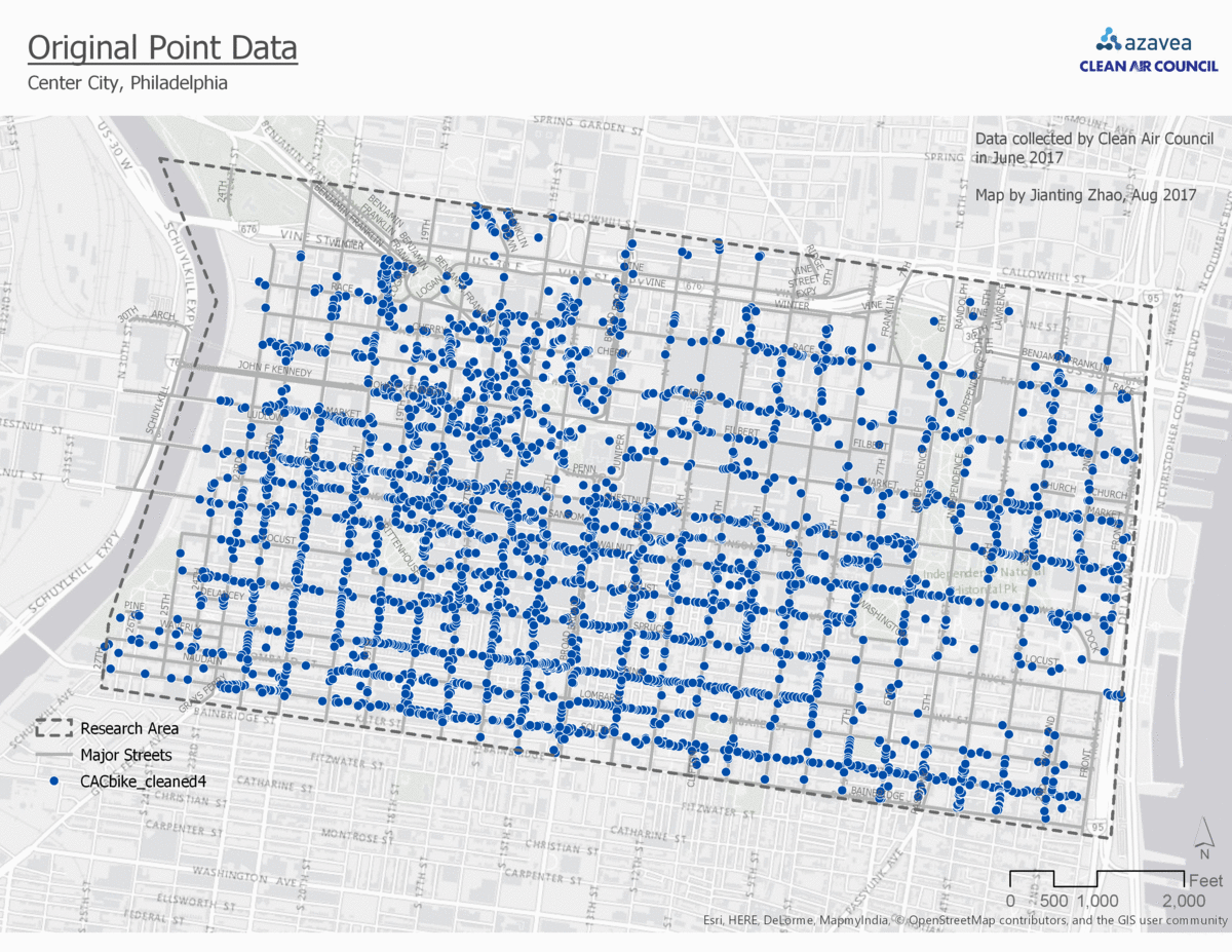
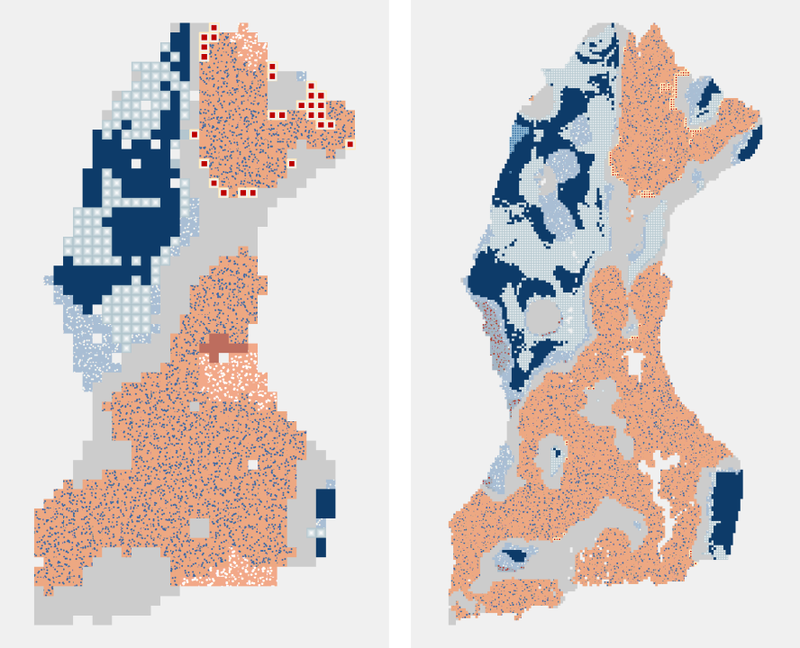
Comparison of 4 Point Data Aggregation Methods for Geospatial Analysis
This post is part of a series of articles written by 2017 Summer of Maps Fellows. Azavea’s Summer of Maps Fellowship Program is run by the Data Analytics team and provides impactful Data Analysis Services Grants for nonprofits and mentoring expertise to fellows. To see more blog posts about Summer of Maps, click here … One…
-
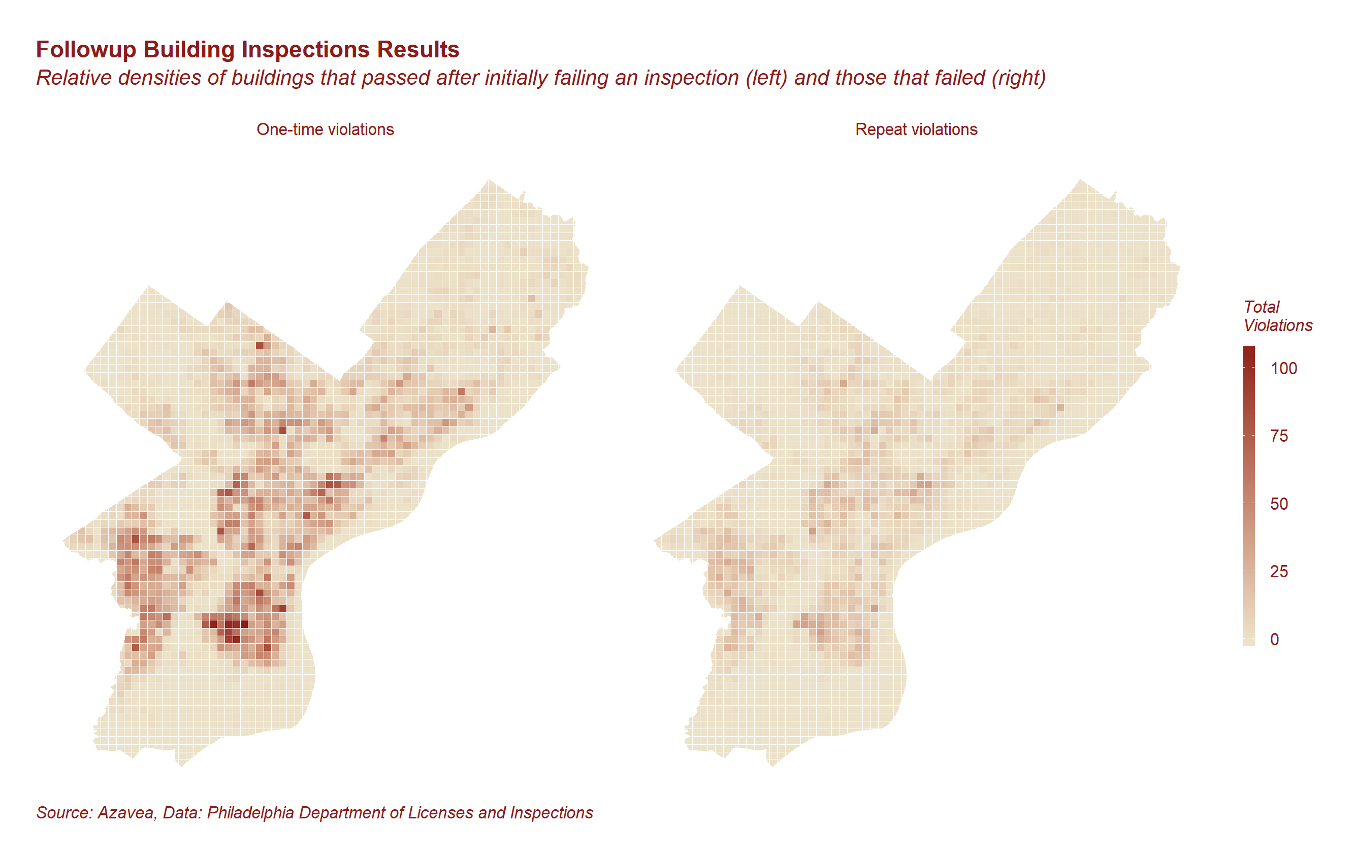
Predicting Building Code Compliance with Machine Learning Models
Which buildings should inspectors prioritize? We used machine learning models to predict building code compliance and address resource allocation questions.
-
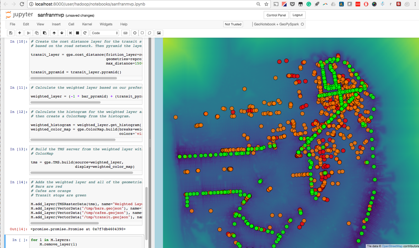
Introducing GeoPySpark, a Python Binding of GeoTrellis
GeoTrellis is a Scala library for working with geospatial data in a distributed environment. While powerful, it has a limited user base due to the geospatial community’s preference for other languages such as Python and R. Bringing GeoTrellis to another language has thus been a requested feature of the community. Well, after nine months of…

-
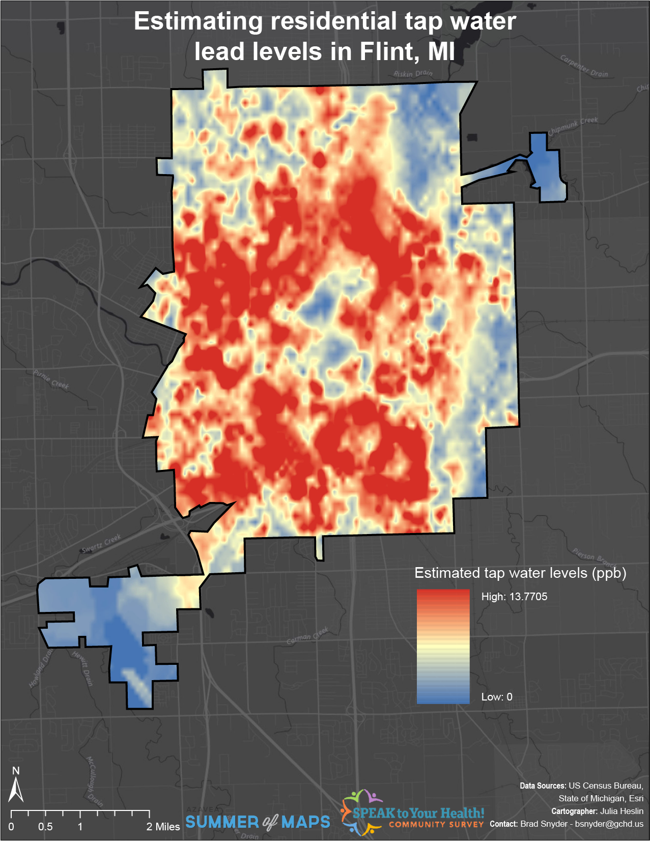
Interpolating Lead Levels from Tap Water Samples Following the Flint Water Crisis
This post is part of a series of articles written by 2017 Summer of Maps Fellows. Azavea’s Summer of Maps Fellowship Program is run by the Data Analytics team and provides impactful Data Analysis Services Grants for nonprofits and mentoring expertise to fellows. To see more blog posts about Summer of Maps, click here … The…
-
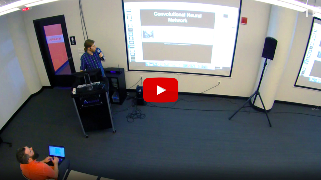
Video: Using Convolutional Neural Networks to Automatically Analyze Aerial and Satellite Imagery
In this recording of our most recent Technical Staff Meeting, we walk through our team’s work on Raster Vision, a set of open source tools for automatically analyzing aerial and satellite imagery using convolutional neural networks. As part of Raster Vision, we have implemented approaches to tagging (predicts a set of tags for each image)…
-
Emerging Hot Spot Analysis: Finding Patterns over Space and Time
This post is part of a series of articles written by 2017 Summer of Maps Fellows. Azavea’s Summer of Maps Fellowship Program provides impactful pro bono spatial analysis for nonprofits, while fellows benefit from Azavea mentors’ expertise. To see more blog posts about Summer of Maps, click here. Analyzing data over space and time can…
-
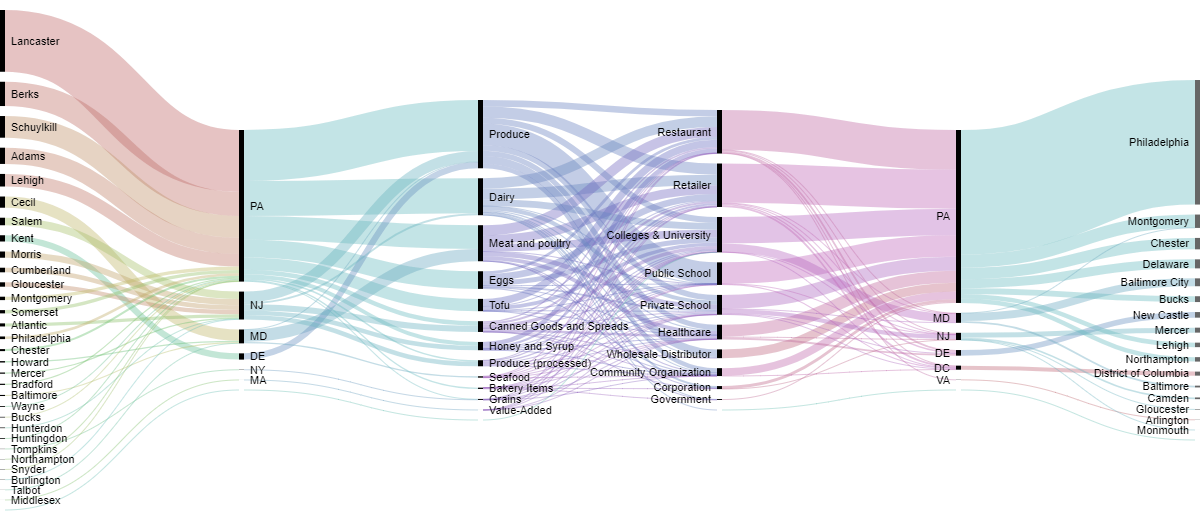
Sankey Diagrams: Six Tools for Visualizing Flow Data
This post is part of a series of articles written by 2017 Summer of Maps Fellows. Azavea’s Summer of Maps Fellowship Program provides impactful pro bono spatial analysis for nonprofits, while fellows benefit from Azavea mentors’ expertise. To see more blog posts about Summer of Maps, click here. One of the non-profits I am working…
-
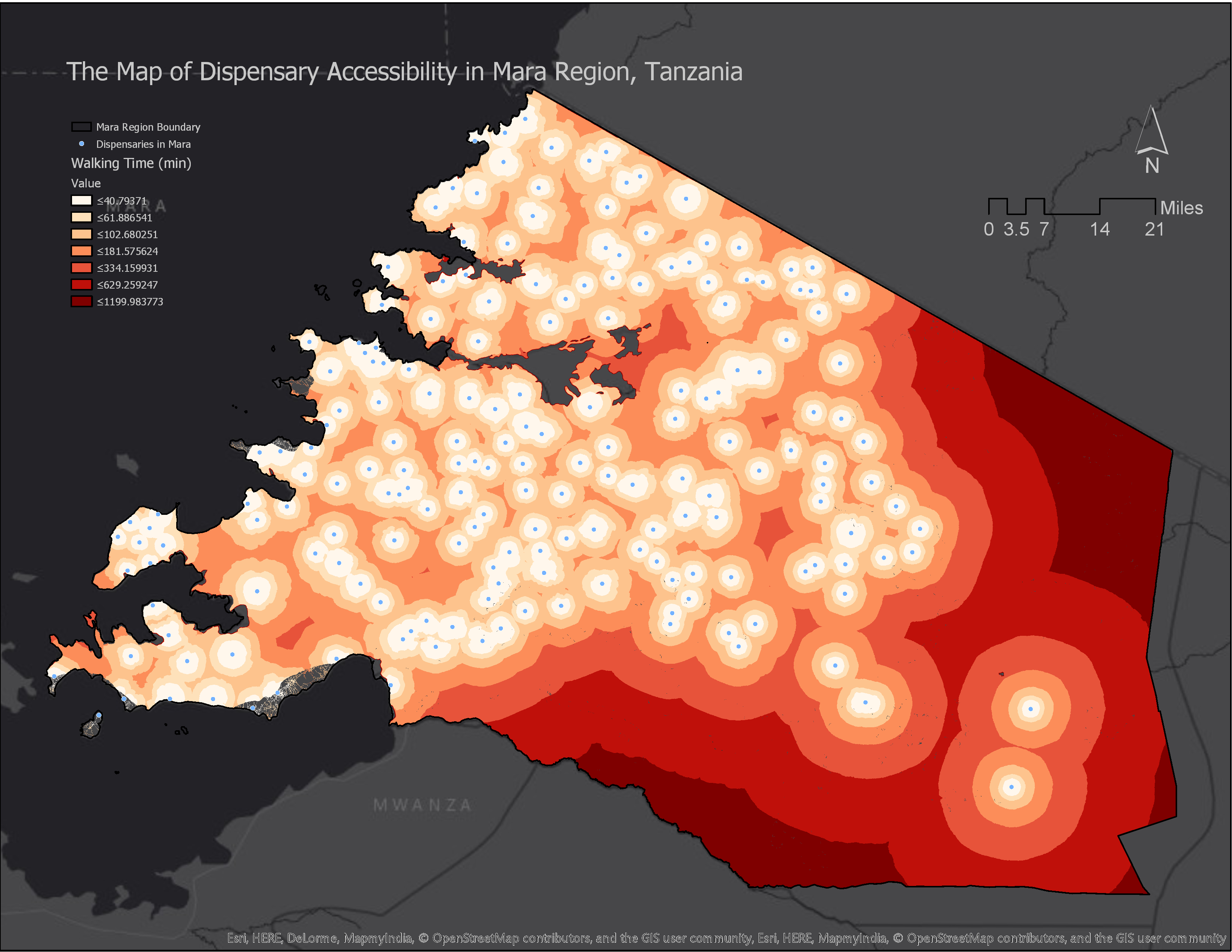
How to Calculate Location Accessibility with AccessMod 5
This post is part of a series of articles written by 2017 Summer of Maps Fellows. Azavea’s Summer of Maps Fellowship Program is run by the Data Analytics Team and provides impactful Data Analysis Services Grants for nonprofits and mentorship to fellows. To see more blog posts about Summer of Maps, click here. Mapping location…
-
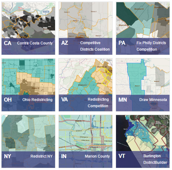
The Road Ahead for DistrictBuilder and Public Redistricting
Seven years ago Azavea began working with the Public Mapping Project to create DistrictBuilder, an open source, web software tool that would enable people to draw their own legislative district plans. We worked with leading redistricting experts: Michael McDonald (Associate Professor at the University of Florida and head of the Elections Project) and Micah Altman…